Hello. My name is Mustafa Alami.
I am a freelance UX Design Director. I make applications simpler, faster and smarter. Please contact me for availability: hello@malami.com
I also illustrate stories and sell art at numyum.com. Thoughts on UX design are on uxdesignbits.com
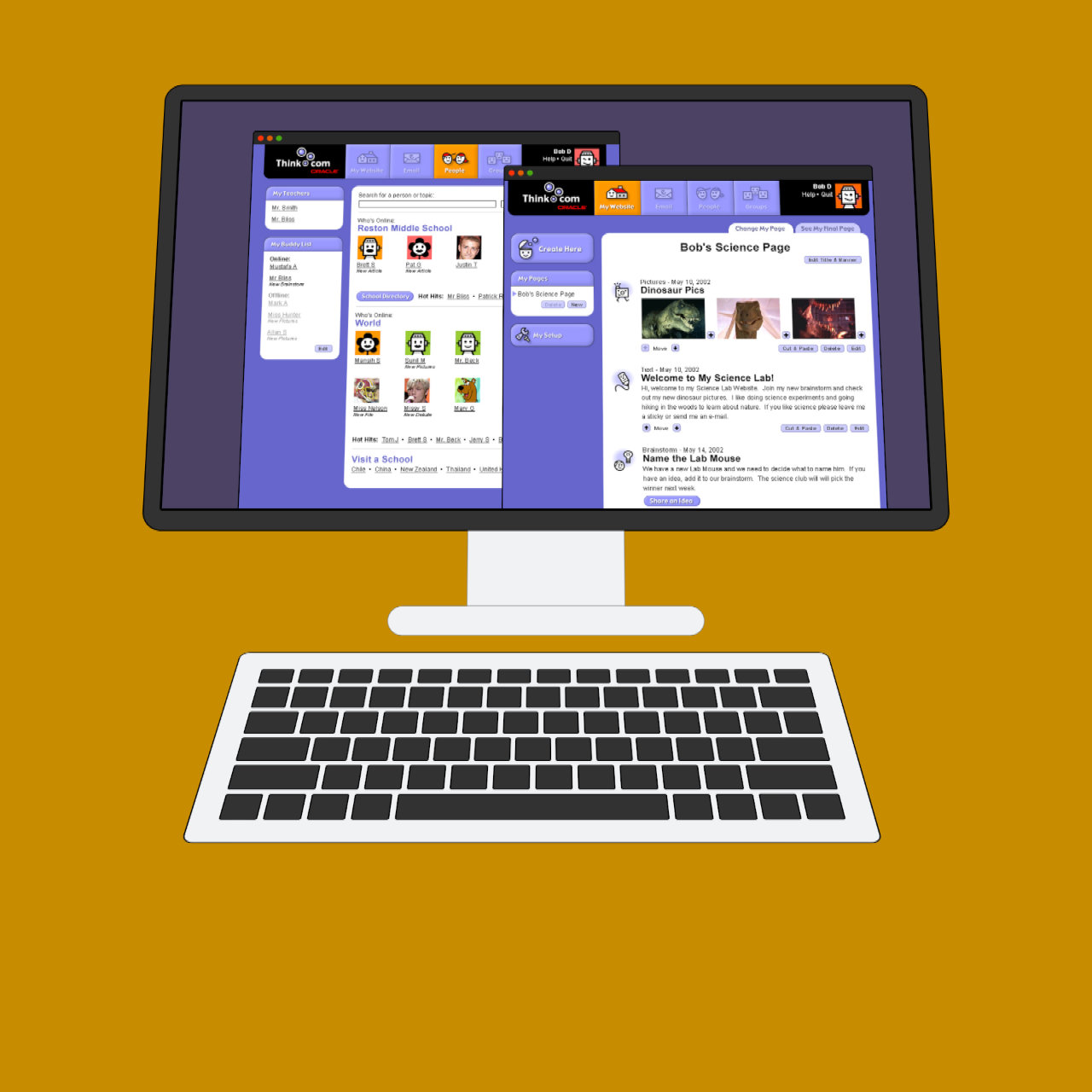
Boomtown, Moodys, Zenreach, MonjWell, Manywho, invoice2go, Cleanfund, Insureon, Waggle, Stubhub Call Center, Levaty, Facebook, Cisco, Modemetric, Stubhub Field Services, Monj, Tout, Multipop, RedTricycle, Salesforce Agent Console, Salesforce Answers, Salesforce Help, Salesforce Tablet, Salesforce Contacts, Salesforce Account Feed, and Oracle Think.com.
Mustafa recently helped us revamp our entire feature rich cloud UX. The experience he brought has been invaluable and he greatly simplified our workflows in ways that we did not think were possible. He has also been a great partner in defining new designs that incorporate AI supervision and recommendations. There is no question that he has had a direct impact on our revenue, is accountable and delivers on time, and collaborates well with both developers and with end-users for design feedback. We have been lucky to work with him.
Alfred 'Chip' Kahn IV | Founder & CEO at Boomtown
Mustafa is seriously talented. He seamlessly weaves company vision with customer feedback and turns it into a simple, intuitive, and powerful product design. Mustafa gets to the heart of the problem you are solving and will challenge you think through multiple solutions to the same problem (many of which you would have never considered) before proceeding down one path. He’s fun and easy to work with and he would be a huge asset to any team that he is a part of. I highly recommend him.
Alan Finlay | VP of Product Experience at Boomtown
Please visit www.goboomtown.com for the latest on the product.
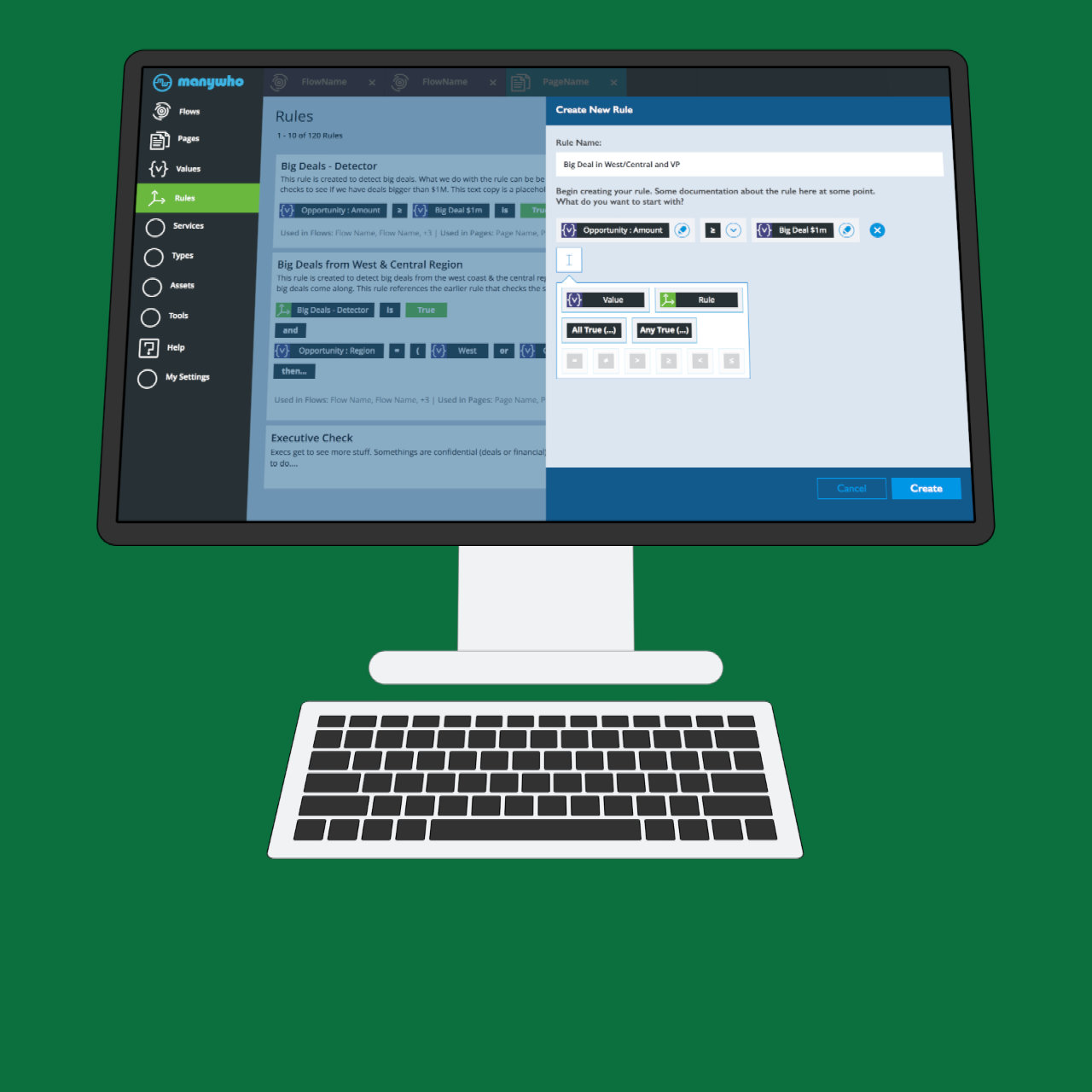
Manywho is an application builder. It was acquired by Dell.
Project Scope: The goal of the project was to streamline the experience and solve roadblocks. People would have to stop mid-stream because some value was not created. I needed to find a simple park, split task flow and resume pattern we can adopt. Along the way, I had the opportunity to create a more robust landing experience, inject needed user feedback, and round the application with needed components. Fortunately, I had the opportunity to take the project through the design process from market research, user interviews, document and share experience challenges with the team, concept design solutions and tackle the detail visual design layer.
Screen: One of the challenges of the project was to find a simple way for people to create a rule. A rule would trigger certain actions. The solution was to create a smart authoring panel that would dim on/off elements that can be dropped at the specific step of the rule create flow.
Mustafa has a unique talent that goes beyond just UX Design. He was able see through the problems and redesign not only the UX of the tools we use but also had us re-think HOW we use them, in doing so re-focused us on what we were trying to do. This new approach and his eye for detailed UX transformed how we thought about our tools and quite simply revolutionized our tools. I cannot recommend him any more highly for big jobs that need amazing results!
Travis Marcus Dawson Head of Internal Products at Stubhub
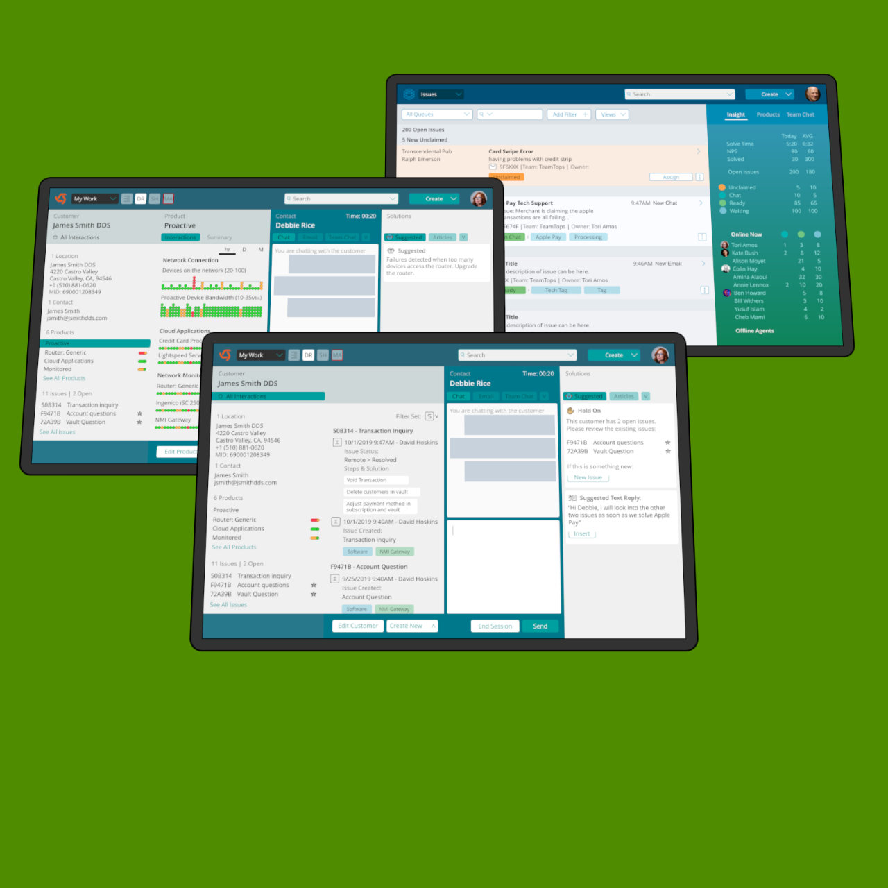
The goal of this project was to create vision the call center agent experience.
The Problem: A customer called with a ticket order issue, an agent would jump from page to page and mentally stitch a picture of the customer and the order. It was fragmented system of records.
The Vision: One integrated experience. Quickly paint a picture of the customer with one living page. If an agent needs more details, we push the information into the view. In the end, all the metrics improved with the redesign and value was quickly realized.
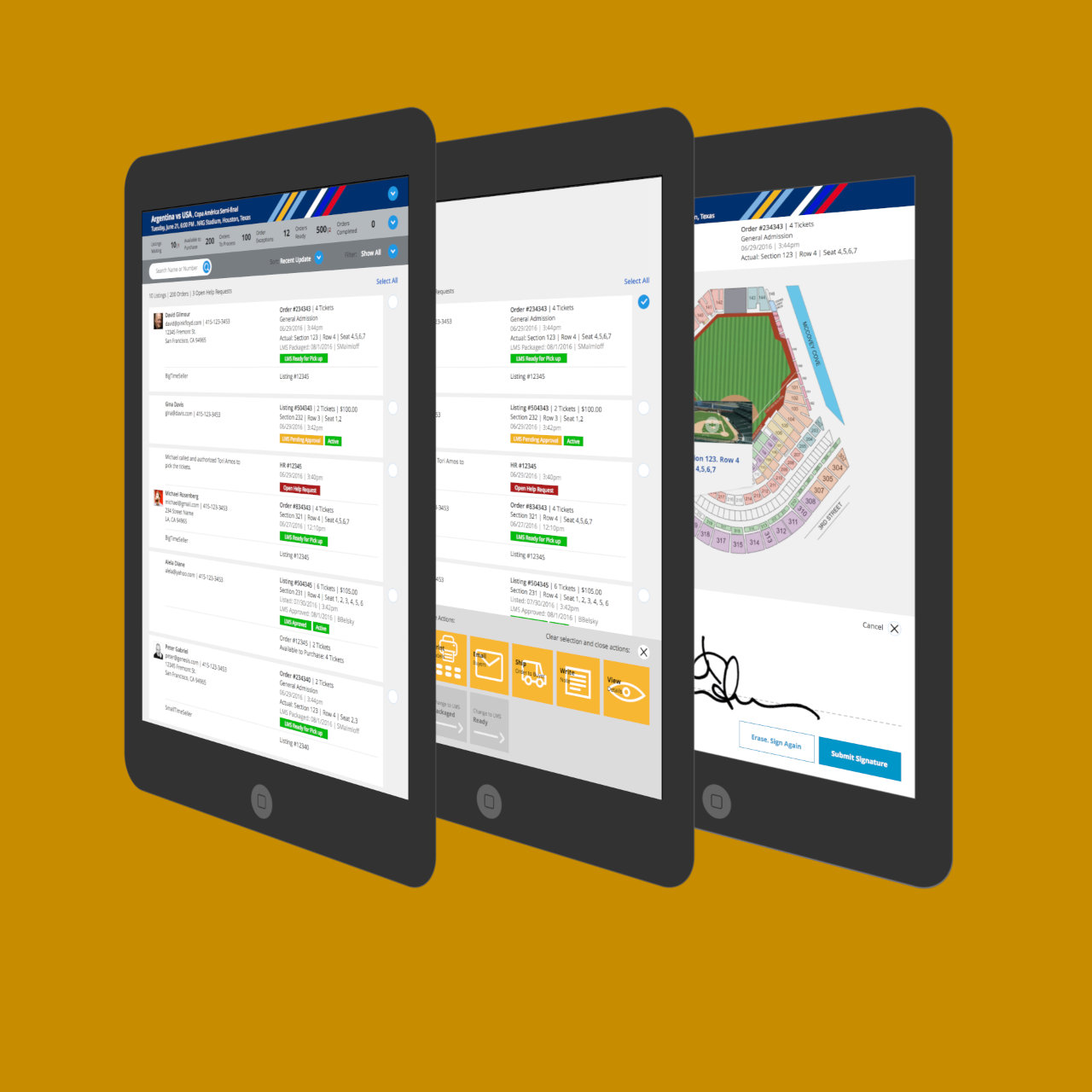
What: Stubhub field service facilitates the exchange of tickets at events. Sellers drop tickets, agents package orders and buyers pick tickets.
Challenge: The current team pop-up configuration required a complicated set of desktop tools configured with power and wired connections. The challenge was to research the need and propose a more streamlined experience that is simpler and faster.
Solution: One of the key features designed was a smart action bar. Select one item and the action bar activates. Add to the selection and the available actions update. Some actions can be applied to multiple orders. The action bar is smart enough to automatically adjust to what is selected.
More info:Video of the Prototype
About: Monj is a skilling application. Monj is sold as a work perk. Please have a look at Monj.com for the latest.
My Role: The challenge was to design an application that was fun, flexible and guided. On this project, I helped assemble the dev team, create the investor deck, help the team define and focus on specific personas, design the overall application architecture, design the details, help guide and mentor a few internal designers, usability test the experience and get a beta launched. This was a 3 months project running at 3 days a week. A few of the experience artifacts can be found on here: Monj Project
Mustafa has made critical contributions to our product in a short time, making it simpler, more focused and more immediately impactful. He's a pleasure to work with: very pragmatic, works quickly, challenges your thinking when it needs to be, adapts to budget and technical constraints, gets all the details worked out and is genuinely nice person. I've extended his role on our team twice as of this writing and highly recommend him.
Steve Harshbarger President at Monj + Multipop
About: Tout manages video publishing across 2,800 news outlets. The application seamlessly runs in the background matching articles with video and ads.
My goal was to help the company complete its transformation from a B2C video sharing application to a B2B video publishing platform serving news outlets. I needed to create an experience that meets the needs of the publisher partner.
Screen: In the past experience the publisher would land on a list of users. It was a page that didn't need to be modified much. A new landing experience was created that would highlight tasks, show the videos that need to be approved, show the ad revenue generated using Tout and expose new opportunities. More information can be found here: Tout Project
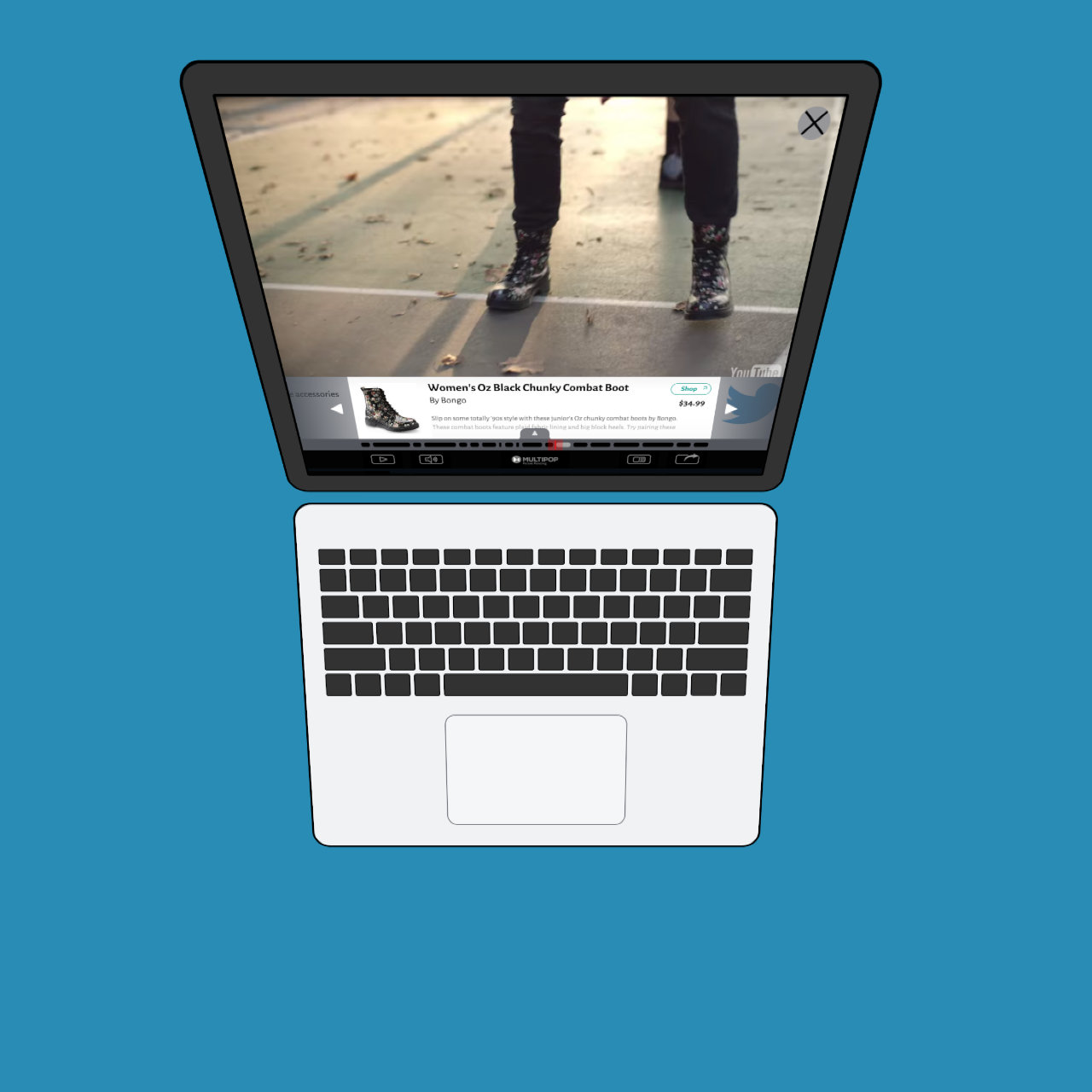
About: Multipop transforms video by adding interactive content. Within minutes, people add e-commerce, create advertising opportunities, and engage user with in-depth product info. More information can be found here: Multipop Project
The challenge was to create an experience that is simple, quick and rich with detail. All people need to do is add a photo for a post to be created. The application prompts them later to enhance it. More about this project: RedTricycle UX Design
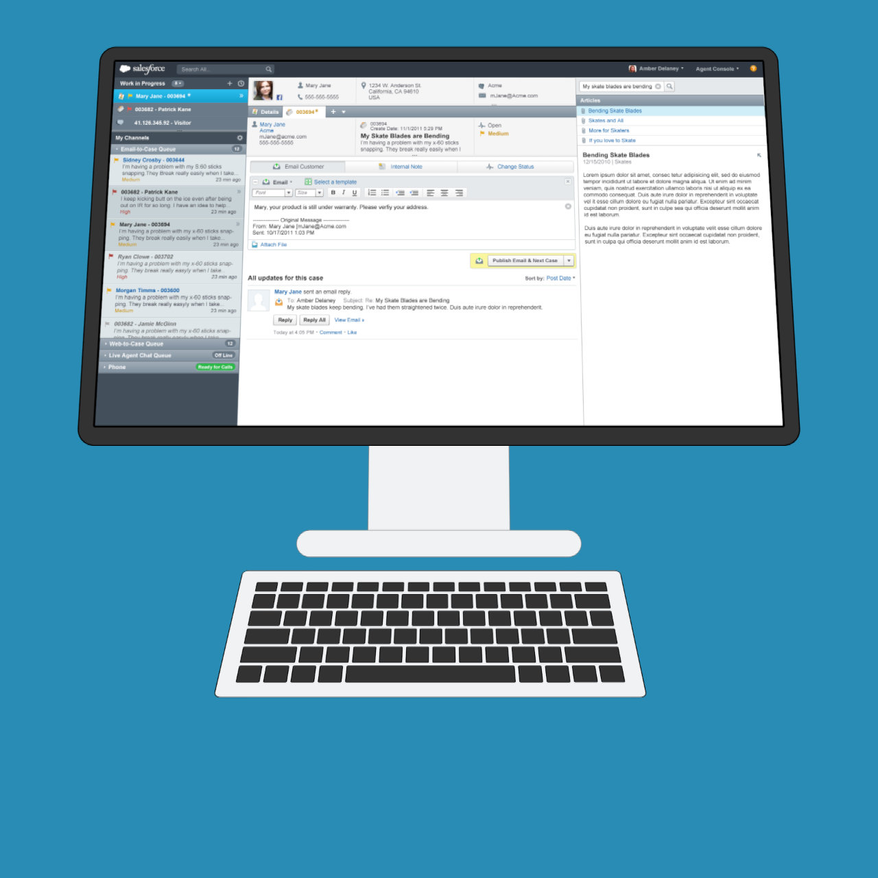
Salesforce Service Cloud Agent Console was sold as box of parts. My goal when I took on leading the Service Cloud UX team was to establish Salesforce as an experience leader in Customer Service. We had leadership in technology, we just needed to push forward a best practice experience vision. My first task was to convince the team and executives that we need to do this. I created this Deck to shed delight around the issue. Fortunately, we pulled it off. I funded resources to the goal, pulled researchers and designers out of scrum and we collectively designed a best practice call center agent experience. We were fortunate to receive several UX specific patents around the project.
UX Related Patents: 20170115829, 9569060, 20140033076, 20140032713
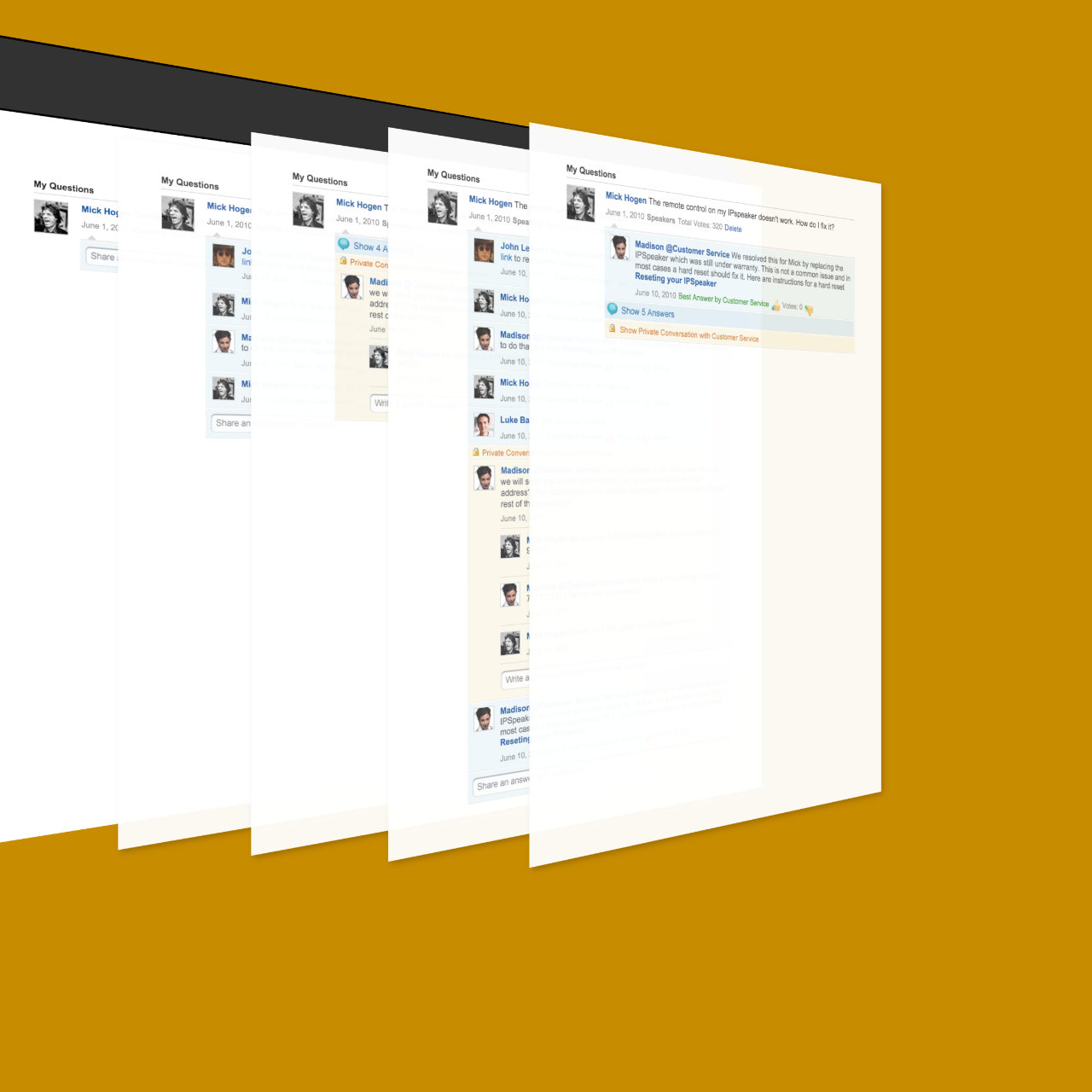
A question and answer application that is integrated with customer service. One challenge was to design a robust answer thread that maintained chronology and allowed for private case conversations.
Links: Design Artifacts, Dreamforce Video Demo on Youtube, Patent US20120130910
Problem: Each Salesforce application screen had a barrage of options to deal with user assistance and help. We had a link to docs, another to FAQ and a separate link to communities. We also had solutions in video and blogs that cannot easily be reached. The best answer could be in communities, but we had no way to bring all together in one coherent help engagement interface. People had to pogo around all the possible channels to find a possible fix to an issue.
Solution: The screen above is a module that solves help. It starts with a unified search that taps all channels. It is followed by an ability to switch ON/OFF inline assistance. It also includes a way to identify company admins, usually the first level of informal support. We also include a module that prompts and rewards users that help others. The last item on the screen tracks any existing support cases a user might have open. We now have one link on each application screen that opens a unified help experience. On larger screens, the help module works inline within your application screen. The goal is to keep the user in context. The long term vision of the module was to bring the actual text of the help articles into the side module so people can read help instructions as they view application screens.
I designed and tested multiple prototypes to discover what users most wanted from the tablet experience. During the process, I developed a jquery plugin that enables quick changes to prototypes.
Problem: All contacts are treated the same in Salesforce. As a sales person, it is not clear who should I focus on at a company.
Design: Segment people into categories. Show who are the executives, decision makers and influencers within an organization. If reporting relationship exist, we begin to show it. The goal of this design is to help the salesperson quickly understand who they should focus on. This was part of a larger effort to rethink how should an account page function.
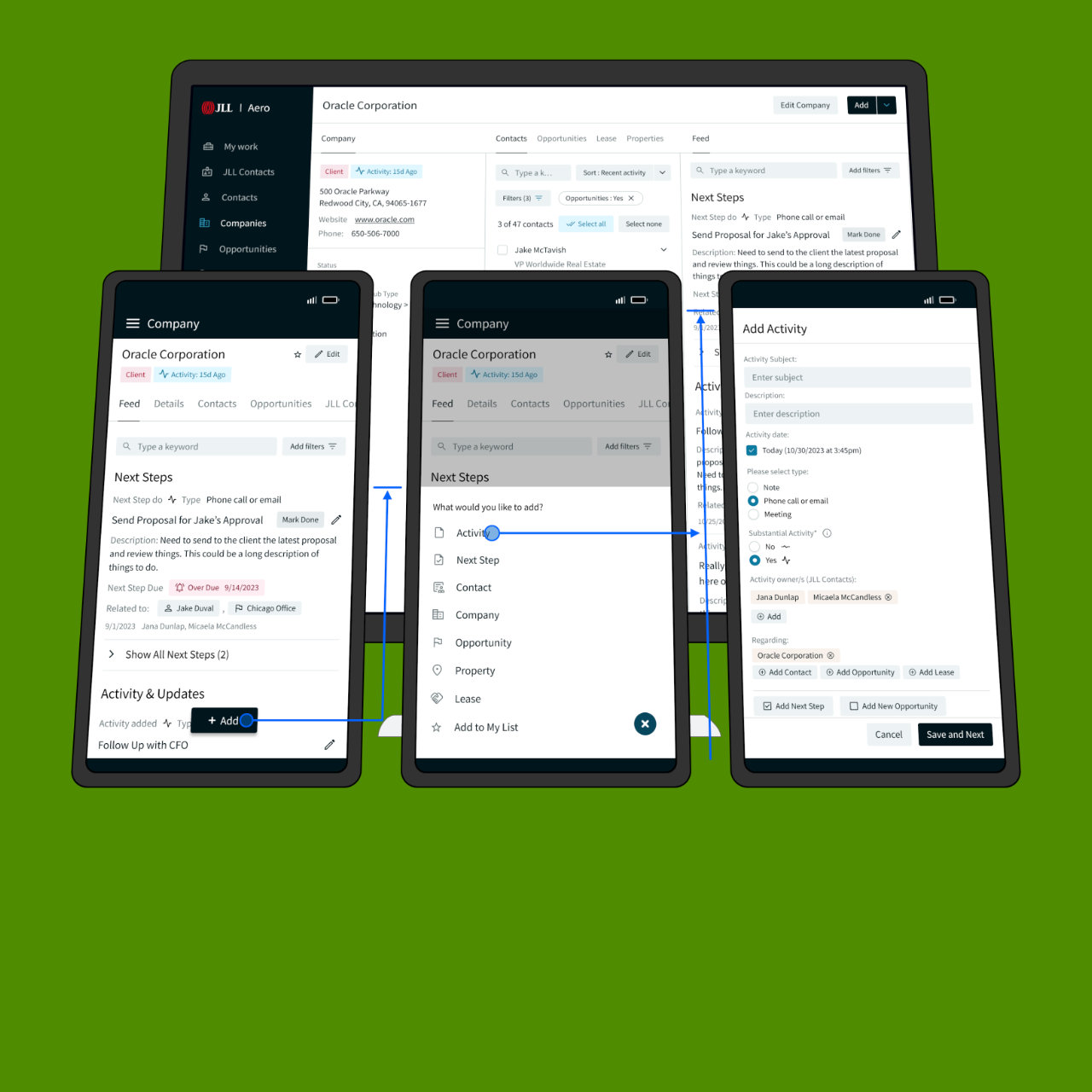
An account is an umbrella object for a customer on salesforce. Unfortunately, the account screen did not provide any insight on customer transactions. The goal of this design was to diagram how the account object would be enhanced over time and provide value. The first screen was meant to demonstrate the problem of just switching on all the transactions. That is not the answer, case transactions will overwhelm the view. Screen two begins to show value by containing the case interactions into one swipe card. Screen three brings enhances things with a roll up summary footer into the card. The last screen would provide actionable prompt cards.