FirstTime
First Time : Set 1
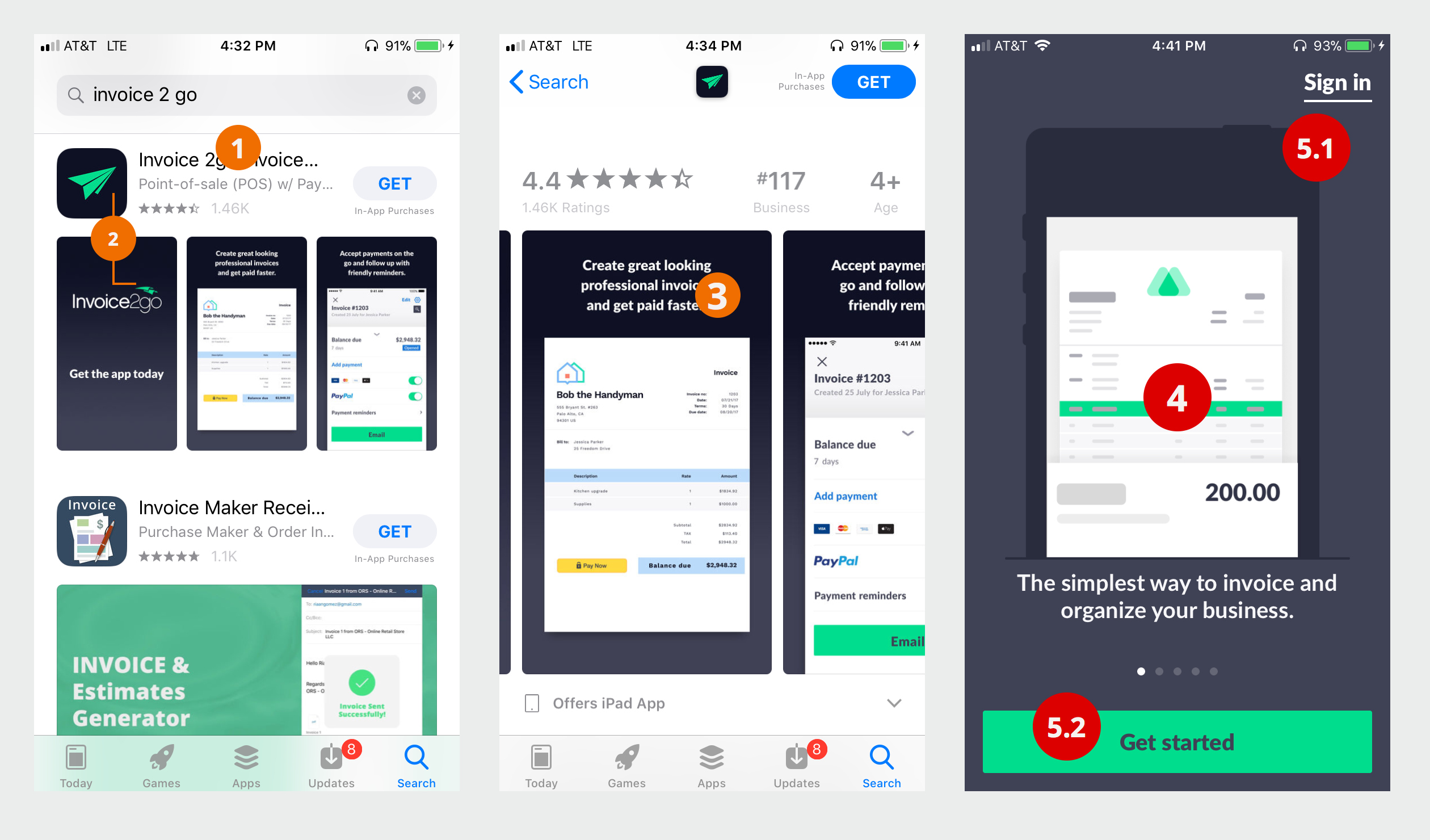
- 1 Why do you start with "Point-of-sale (POS)?" Is that what people search for? I don't think of invoice to go as a kiosk point-of-sale solution. Should it be - "Invoice and get paid faster.." - that first line really does matter.
- 2 OK. Really minor. Why do you have two styles to your paper airplane illustration (traditional and swoopy). Pick one. I only mention it because it did make me pause and double check - is this the correct app? or is this some makeshift copy app?
- 3 Is creating "great looking" professional invoices really the most important thing your clients care about?
- 4 App carousel splash screen are mostly useless. In this scenario they are really useless. Why are you marketing to me again? I already went through the marketing and decided to try it. The only thing that really matters now is helping the user accomplish what they need done. The carousel splash screen might be useful if it helps the user orient them to the application. Actually, that works more after the user has landed into the app they look around - then the screen dims and quick orientation starts. That way, the user get oriented to the space and we provide some helpful information. Recommend you remove it. More stuff on the screen competing for my attention is NOT a good thing.
- 5 This is confusing. Why is Sign in on the top right? Why is get started on the bottom? What if I already have account? wouldn't I just click that one button that I notice - the get started button? I am starting after all --- Better stack them - With more context - Example: "New Here? Sign up" - That would be your primary button. Under it "Already have an account? - Sign In. Why make it difficult for your existing customers to login. Of course, that middle carousel block of marketing doesn't help any.
First Time : Set 2
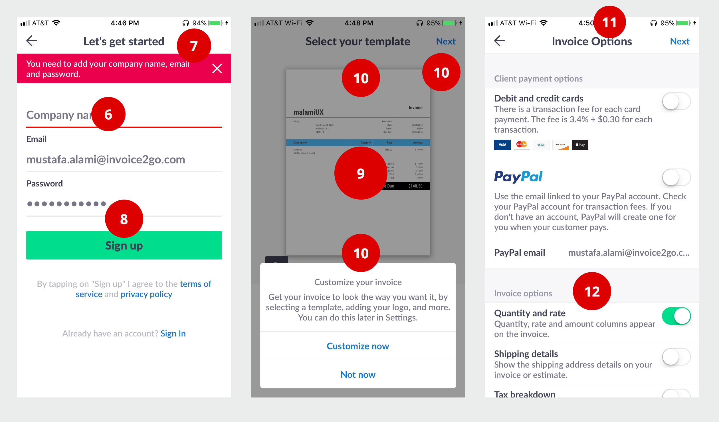
- 6 Why do I need a company? Why now? Why cannot I continue without a company? What if I just operate with my name? Do I associate my name with a company? Again, why do I really need it just to try this app. Why now? Couldn't I just do this later?
- 7 Ok. So "tap to enter company". Why doesn't the error message go away? The "sign up" button drops below the keyboard - so I cannot quickly enter my company and tap sign up. Need to rethink what happens on the screen when the keyboard slides up. A little wonky. I have an iphone 6 - things probably really fall apart on smaller screens. Ideally, we give you the error message - then when the user clicks the section that needs to be fixed the keyboard slides up and the error message goes away and the company field is in focus ready for input. The [sign up] continues to be on screen as the primary button.
- 8 BTW. This should be your first screen. Well, a version of it.
- 9 Why customize as a start - I don't care how it looks. BTW. I am designer and I bill clients for work - I personally don't care how my invoices look. PLUS - when I want to customize something I want it with context - after I enter the information - here what your invoice will look - like it send it - don't like it -- make it better.
- 10 This was very confusing. Do I select a template OR do I customize? I viewed the options as two distinct things. AT this stage I was really frustrated - It was hard enough getting here. I just want to send an invoice. SO. I see the NEXT on the screen and I clicked NEXT - What happened - now I am in template hell selector. OK. Really need to rethink this screen - if you are going to slide up a modal selector - display:hide - all the controls under - NO. the dim screen is not a clear signal indicator that I cannot tap the links. All I wanted to do was go to the next section. PLUS - the wording is all wrong - if the instructions say "you can do this later" - make sure the thing I click has the SAME words - "Do this later" - "Not now" does not work. People look for patterns, don't make people over think this.
- 11Agh! More things to do, all I want is to send an invoice. Shouldn't the heading be "Payment and Options." This might be just me, but I always think of "payment" as me having to pay people. When I think of people paying me - I think of it as "Getting Paid." Maybe that section heading should be "Getting Paid" or "Get Paid Faster" - align it with your marketing. ALSO. What is more common - Debit Card or Credit Card - whatever it is should be first on the list.
- 12 Again. Too much stuff to process now. It took me a long time to really process Quantity and rate - I personally send invoices every month. My invoices have a quantity and rate, BUT this confused me. Maybe it should be presented as? do you charge a flat fee or quantity x rate - maybe adding some context helps anchor it. Also. The display column - maybe you don't to explicitly say it here. The other options seem like things I want to do later - when I add the first thing, just ask me if this taxable - then make that the default option. What happens when some things are taxable and some not? Is it really a global option? You are forcing me to make lots of decisions before I can send an invoice and see if this app does what it needs to do. LAST on this section, make it clear to the user that this can all be done later.
First Time : Set 3
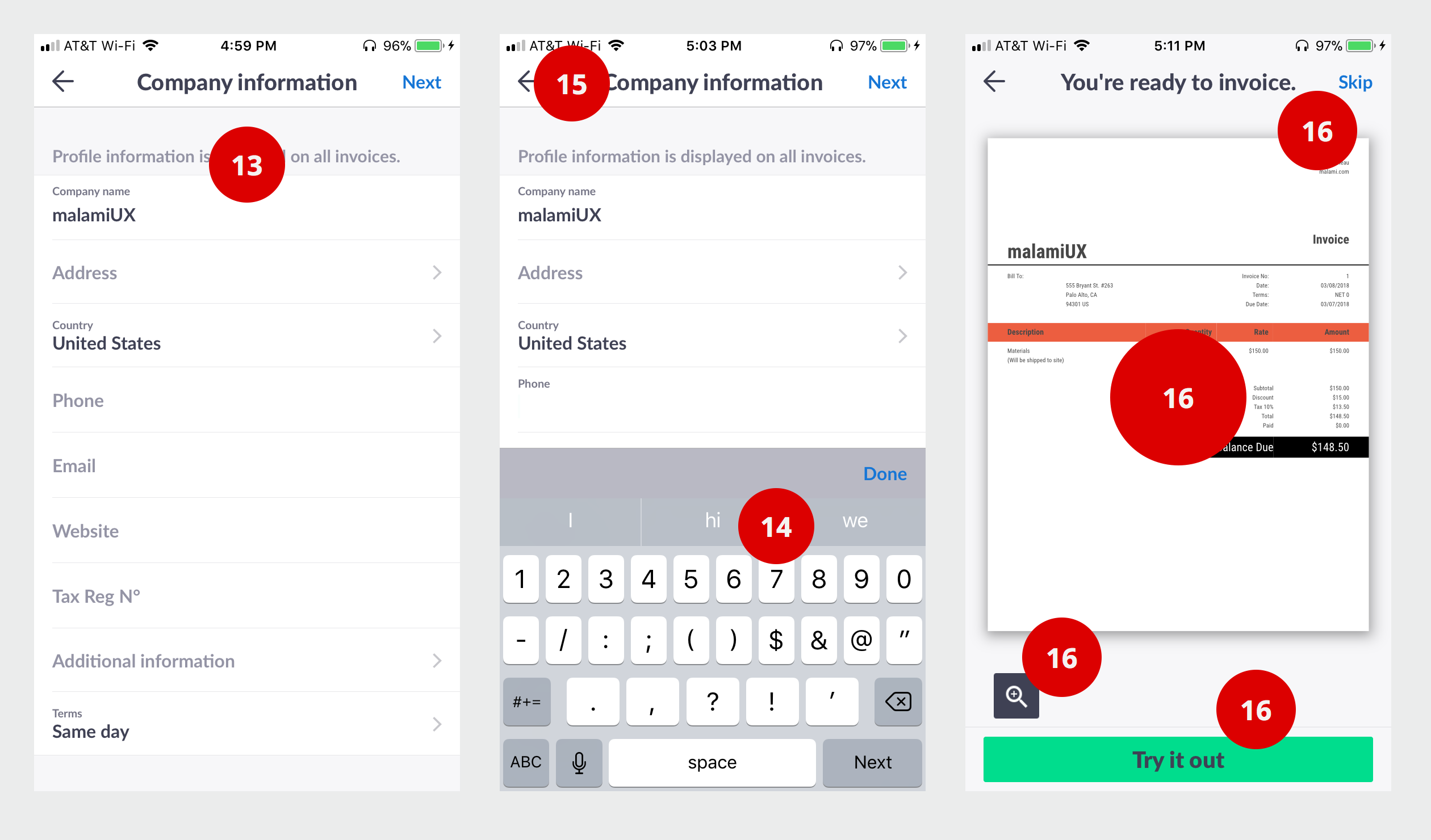
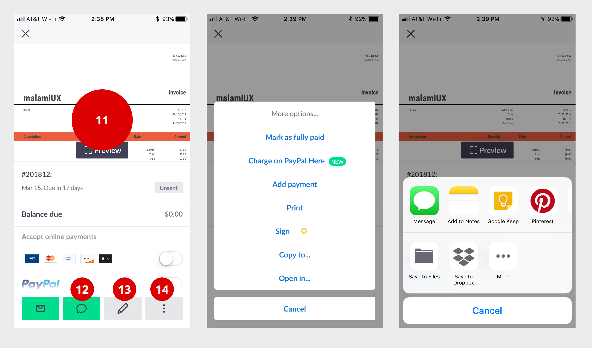
- 13 Where is my payout - my hero - my invoice? Really! Cannot I just create an invoice - and plug that in with the first invoice? ANYWAY. Lets, carry on (A momentary breakdown) ... What is Tax Reg N - should that spell out number? Why would I want that on my invoice? It might be relevant in some countries - BUT - you already know I am from the United States - you put that in automatically - SO - you should be smart enough to know that in the US we don't know what N with small circle is - and we mostly don't add tax number on invoices. What happens here needs to be smart and location aware. We want people to quickly think - Aha! this is exactly what I need - it relates to what I do - They understand and know me - What we don't want - Hmm.. this must be some foreign thing. ALSO. Address field - just one big empty text block - why? Where does additional information go. Why even ask it here?
- 14 Why are you showing - I - hi - and we - above the keyboard when I am trying to enter a phone number (Does the same thing when I enter email or website, really frustrating auto correcting website address) SOMETHING like this has to exist in iOS --- input autocomplete="off" autocorrect="off" autocapitalize="off" spellcheck="false"
15 Lets say I want to add a number, I tap it - great - keyboard slides up - then I decide, you know what, I don't want people to call me. So. I decide not include it and tap the top left --- Agh! I was kicked out of the form. completely. Tap Back should cancel the last interaction which was to simply take an input. We should not spit the user out of this page just for getting out of input mode.-
- 16 OK. This is extremely confusing. What is this page? What purpose does it serve? What is Skip? Skip what? Skip invoice to go? What is Try It Out - I am trying it out. Do I start over? What do I do. How do I send an invoice to my customer "john" - on-the-go! ? What is Magnify icon do? What do I magnify? Cannot I pinch and zoom. This is really confusing. How do I create an invoice ?
First Time : Set 4
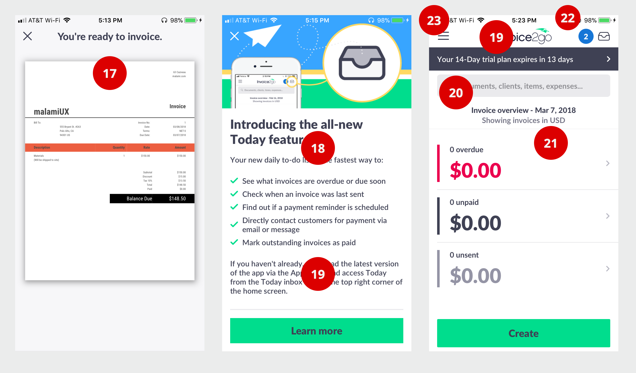
- 17 I clicked magnify. Nothing happened. What do I do now? Is the app broken? Did it lock up and freeze? Found the x and clicked it.
- 18 Finally made it. Oh. No. After a very brief look at the interface - this annoying screen came on. What is this why? What do I do with this? Every thing is new to me. Why is so much more important? Is this more important than creating an invoice. New feature release - should never - ever take over the screen. It should also never ever be presented to a new user. ALSO. What is the primary button - Lean More - what does learn more do - take you completely out of the App into a blog post. Excellent you just tossed me out. MORE. The copy - "If you haven't already downloaded the latest --- you should know if I have the latest. New features should just be another notification. We should never create another channel to communicate with people when we have two already (inbox and notification) - still trying to understand the purpose they serve.
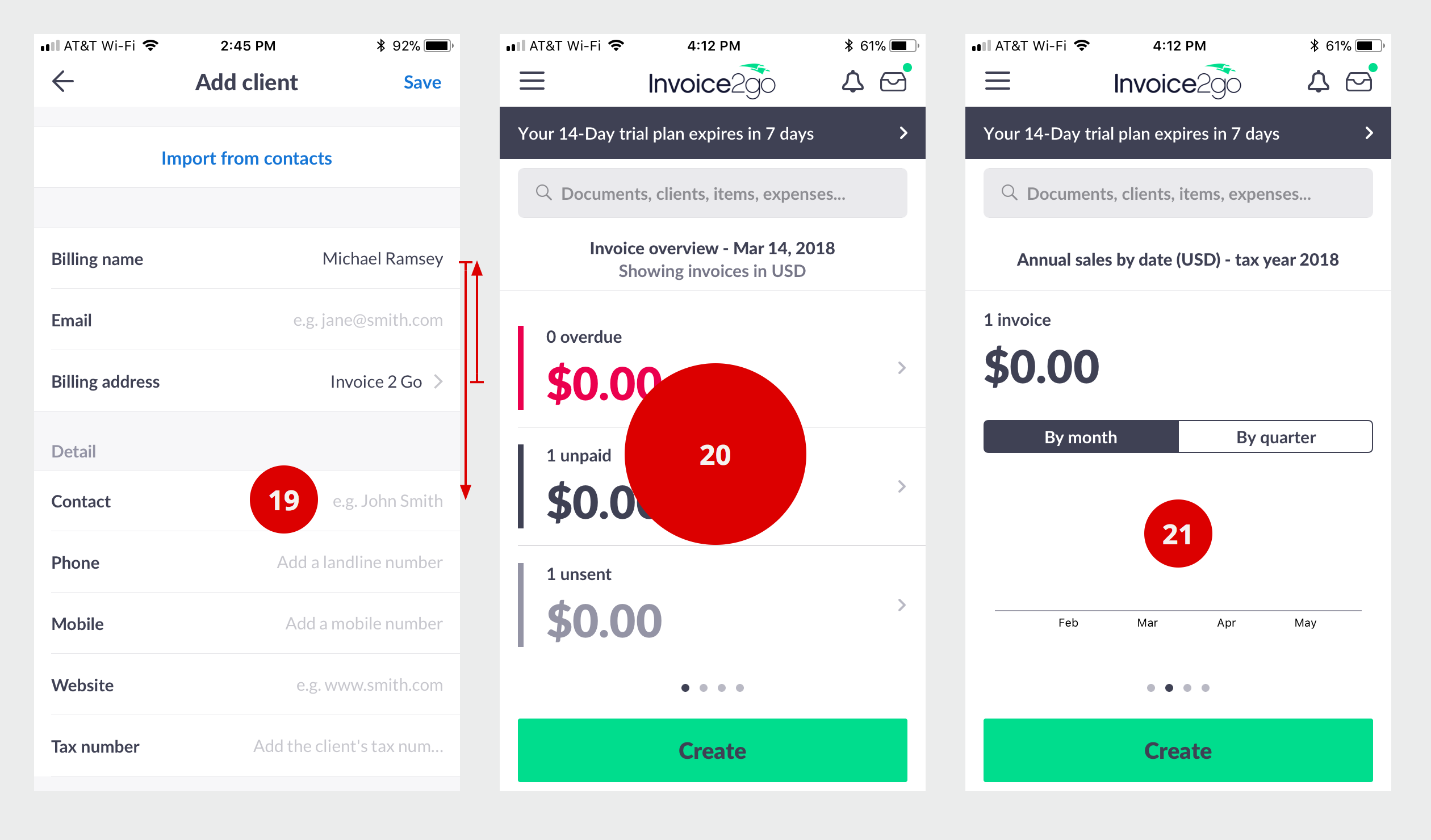
- 19 Really! My 14 day trial expires in 13 days! I just installed the app - how did we get to 13 days - you cannot give the 14 days. I get it, but not the warm and fuzzy.
- 20 I have nothing. Why search. All I am going to get is nothing. Unless I can search help here or some best practice blog.
- 21 USD. Why is that here? What else would that be. In the US we don't show USD.
- 22 Don't understand the number next to the inbox. I have two things in my inbox? Oh. This is something else - notifications. Why do I have 2? Confusing.
- 23 Hamburger is not discoverable. Really. Run some usability test and you will find lots of people that would not click the hamburger icon. If you really want to have a hamburger menu - then I would start with it open. OK. Really . How do I send an invoice?
First Time : Set 5
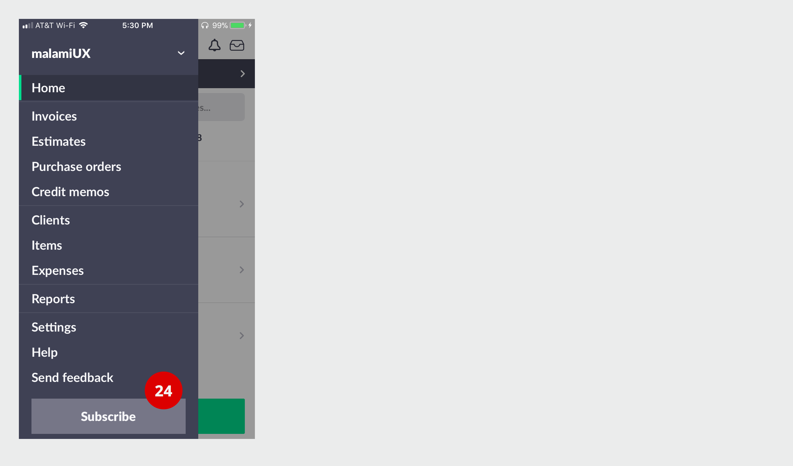
- 24 What is subscribe? Join a mailing list?
Create Invoice
Create Invoice : Set 1
- On another day. Decided to do create an invoice
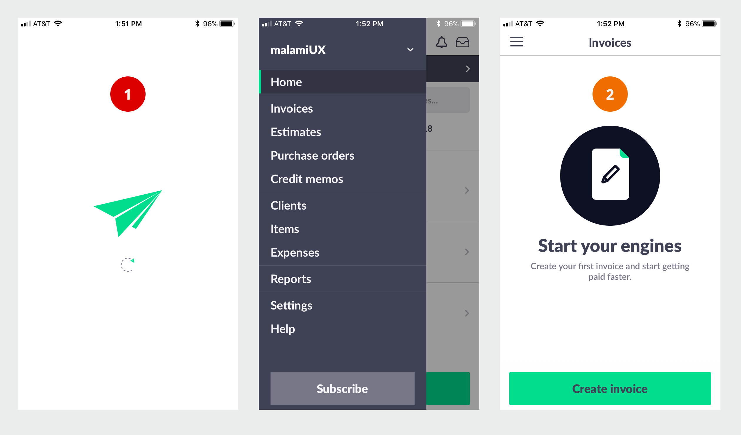
- 1 This took a long time to load. ?
- 2 Ok. This seems like a useless page. After clicking the hamburger menu to get to invoice, then here. Maybe it doesn't need any copy. Just one image and Create invoice. It's not a bad page - just seems like a another roadblock to starting an invoice.
Create Invoice : Set 2
- On another day. Decided to do create an invoice
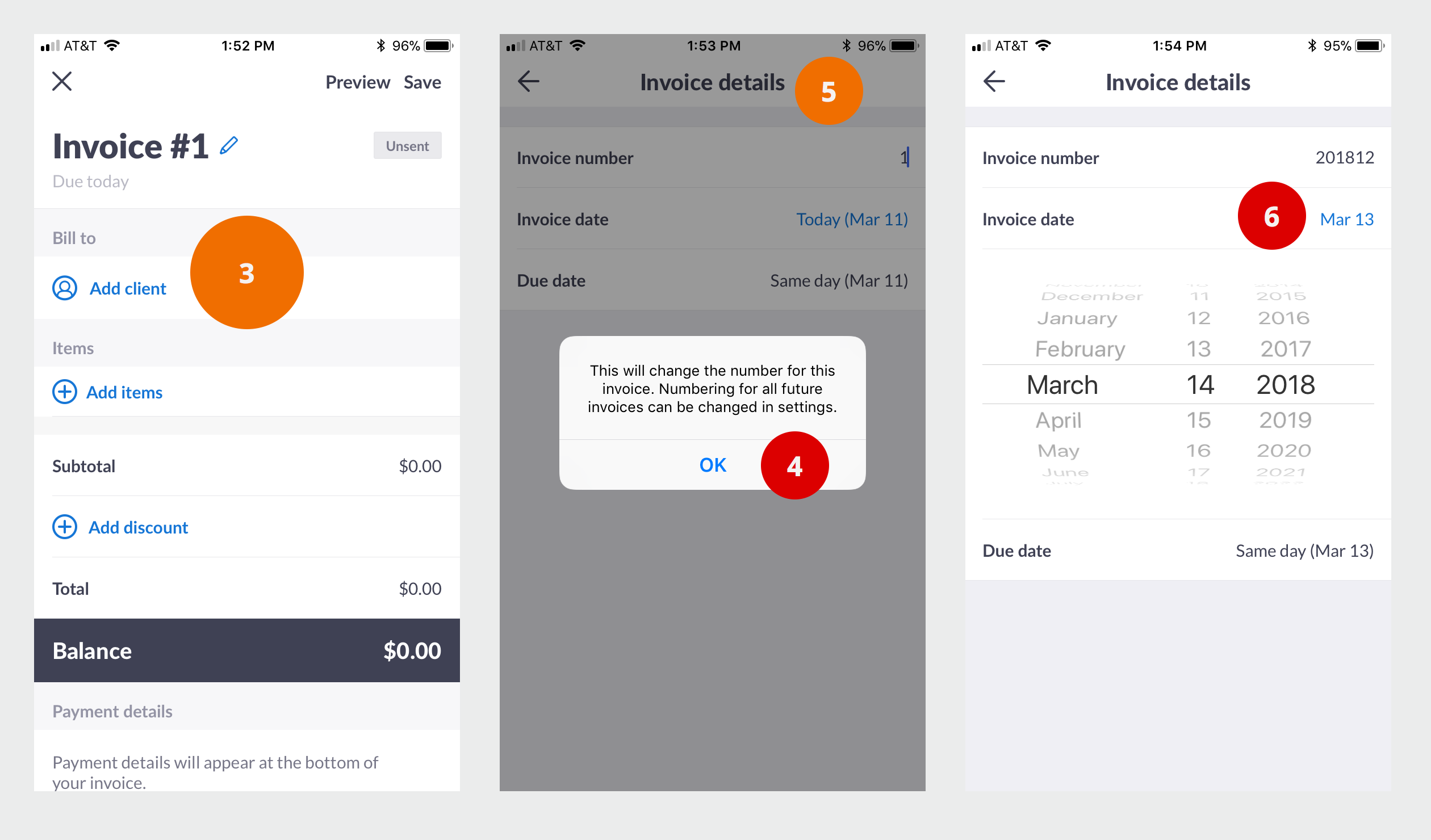
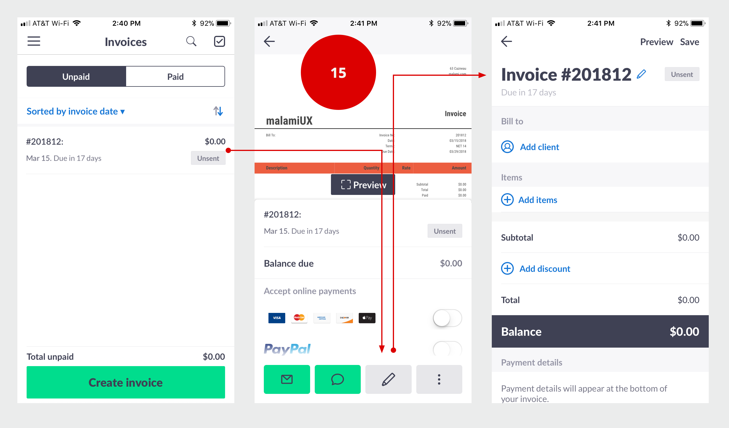
- 3 OK. I want this to be the second page of invoice2go - Page One: sign up/sign in -- then --- Page Two: This page. Some comments - nothing really wrong here - things to explore - should the invoice number be the hero/anchor of the page. I understand preview and I understand save. Lets change the invoice number. I need this pickup from my existing business.
- 4 Agh! A road block warning. Why? You should always just add +1 to the most recent invoice created. SO. If I change the number here to 201812 - then my next invoice will automatically be 201813. That is the norm. Don't toss a roadblock or send me to setting. I personally tweak things at the beginning of each year (just for my personal tracking) my first invoice of the year would be 201801 - Say, I send 24 invoices in the year - in January 2019 - the number will automatically be 201825 (perfectly acceptable and the norm for sequential numbering) - I would manually change it to 201901 - I don't go into setting I just edit the first invoice of the year. Everything should just be +1 the most recent. I like to see my invoice number align with the year.
- 5. Is this really the invoice details? I think of the details as the line items. Not a big item, just something to consider.
- 6 BUG. OK. this is an annoying bug. You cannot match what is in the date picker scroll wheel to the feedback date. We need to establish TRUST with the customer. They need to be fairly confidents that number match up. For some bizarre reason, what gets displayed is ONE day off from the date I pick. So I picked Match 14 but the feedback value is March 13. What is stored? I have no idea? Makes me think... do you make the same mistake when I enter $values..
Create Invoice : Set 3
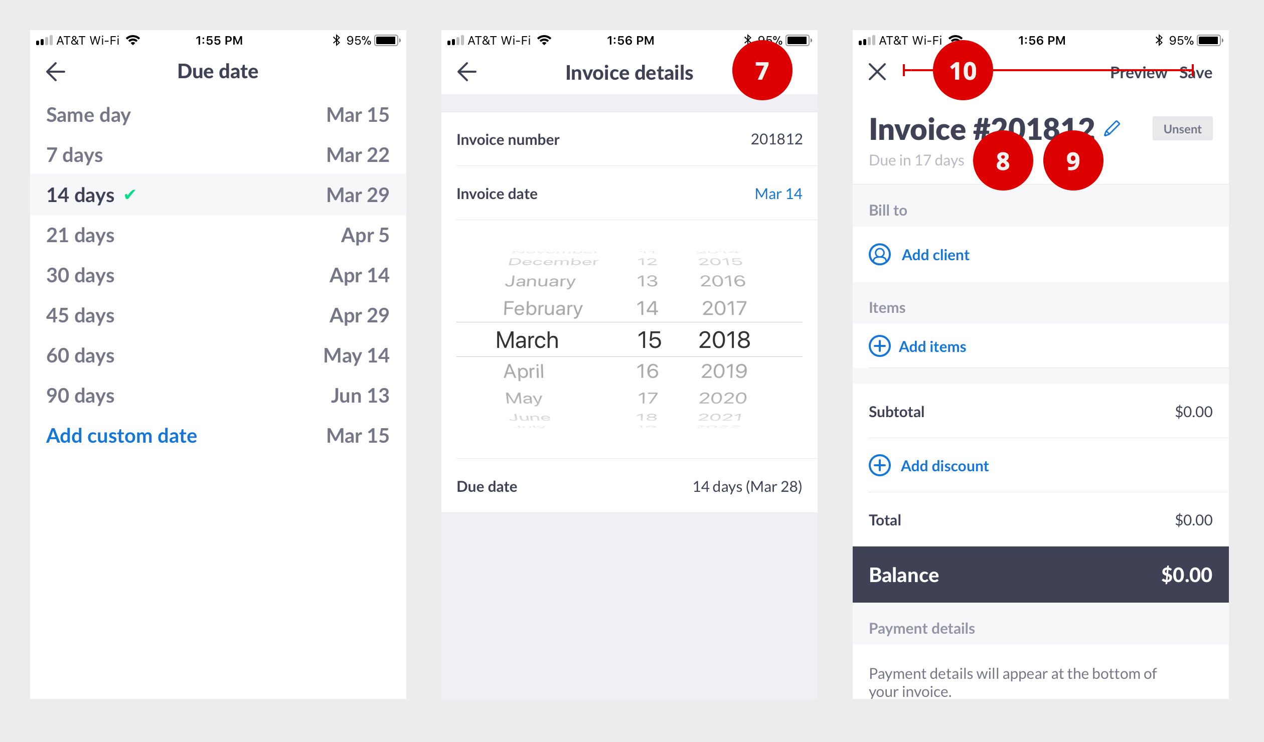
- Changed the due date. Nothing really to note here. I didn't try a custom date. I usually issue an invoice on the 15 and end of month - and I make it due on the end of month or the 15th. I don't see that as an option. BUT. That might just be me that gets that particular.
- 7 Lots of things happened on this page. Feels like it needs a DONE or Save on the top right or bottom. I get that the back will save --- but we trained people that the back is cancel -- not sure on this one. Something to explore. I need to review all the interactions first.
- 8BUG. Ok. This is really bad. What is the deal with dates? I just picked 14 days as a due date. Why do you have 17 days? -- for the record here are the problem with dates - 14 days free is 13 days free - the date picker is one day off from the feedback date --- and here it is 14 days is 17 days.
- 9 Missing? Where is my invoice date? Yes. I really need that here. 2 Reasons. 1. I actually care more about my invoice date vs due date. I track how much I worked/billed for the month, I need to double check invoice date before I send. It might be the 4th of April before I get to invoicing for March. SO. I will set the invoice date to March 31. I want to see my invoicing/sales align with month worked. So, it is important that I double check the invoice date. 2. The second reason, might be more important - if we ask you something in an inline form, we need to roll-it-up into the feedback page. Cannot hide things down the chain.
- 10 Ok. My train is here. What train you ask? This is an app on a phone and we deal with micro-moments and micro-accomplishments. I need to run my business in motion. I need to finish later. I see two options. X - and Save - I am worried if I click the X then it will delete what I just started. X is cancel after all. Excellent. I see Save on the screen. That is it, let me click Save and finish this later.
Create Invoice : Set 4
- 11 What is this? This is really frustrating. No heading or anything? Did I save? Did I not save? What do I do here. How do I get out of this? I expect to return to my invoices. OK. Frustrating! Lets find save, something that lets me finish later.
- 12 What is leave a comment?
- 13 Ok. This is probably edit. I don't want to edit. I want to save it for later
- 14 Lets see if save for later is here... I tap it... Nothing... I try the comment...
- I give up. Let me delete this and start it again later.
Create Invoice : Set 5
- 15 OK. This is really painful to edit. I want to tap an invoice and go directly to the invoice. Why are you sending me to this page, that I don't know the purpose yet. I GET IT. You split the invoice into two pages but somehow, forgot to tell the user about it --- and for some reason we are taken to the last part even though, the first part is not done.
Create Invoice : Set 6
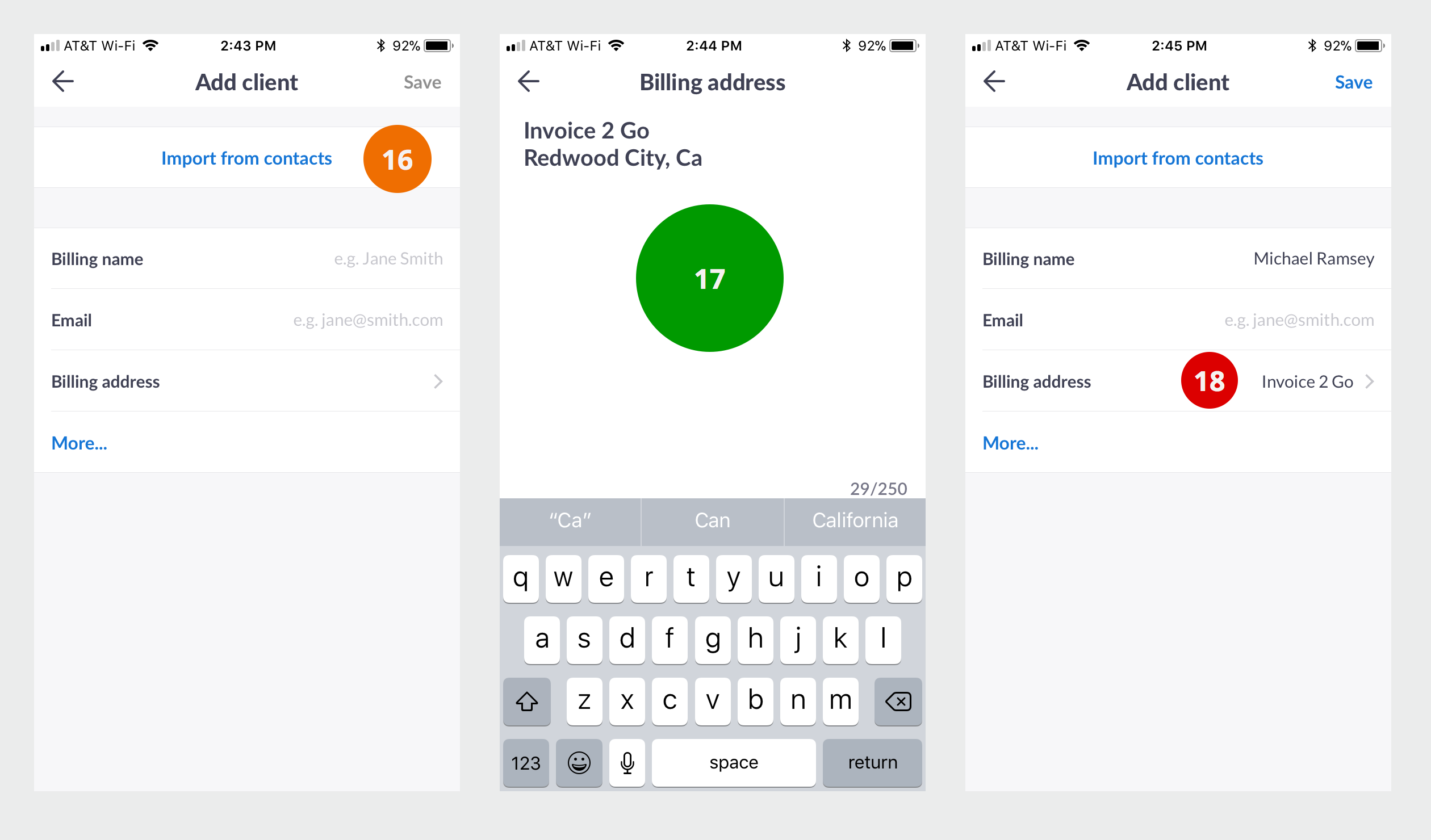
- 16 BTW. I would never do this. I don't want you to import all my contacts and start spamming everybody. PLUS. I don't want to go through integration/select/sync hell.
- 17 Nice! maybe you take unstructured data and automagically structure it. I added the name, now I need to add the company and address. I don't have the zip code.
- 18 OK. Something is wrong here. That should also include the address. Make sure you completely display what I entered here. I need the feedback on the screen to make sure I am doing this correctly.
Create Invoice : Set 7
- 19 Agh! Nothing more frustrating than having to do this over. This is a mess. Why isn't Michael Ramsey under contact? What is the difference between Billing name and Contact? Why did you tell me in your hint text to enter a person's name under Billing Name -- where is company? The billing name should probably be invoice2go. -- That should just be company. Every invoice I send start's with a person - I need a person to be accountable.
- 20 Ok. Another time to finish this invoice. Not sure how I ended back on Home Screen. BUT. I really want a way to access something in progress here. Something that makes it easy for me to finish things.
- 21 Oh. I just noticed this is a carousel. Lets explore. OK. This is a problem. A carousel in a carousel --- Hmm. The month is a carousel and this entire thing is a carousel. Lets kill one. It does make the gesture really wonky - the user really needs to touch scroll outside the calendar region to make it all work. It does not help that we have not visually indicated to the user what is inside or outside. The QUICK scrappy short term fix make the inside carousel darker or with a border. Some clue to the user that we have two regions available for gesture touch. BETTER fix - make it a rule - no carousel inside of another carousel. BTW. As bad as a scroll bar within a scroll bar with a web app.
Create Invoice : Set 8
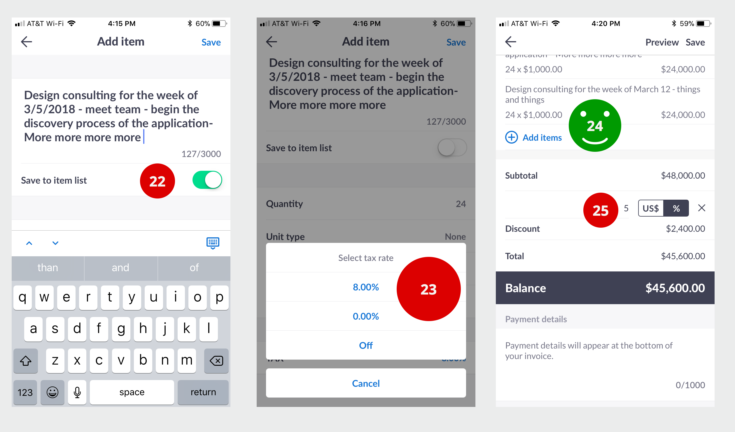
- 22 Ok. We need to address two things in an item - the description and the category. I would never save the description to a list. I would always save the category to a list. Say I am a contractor - I would enter "fixed the south wall windows with new windows" (BTW. I recently had that done on my house) for description - the category would be - window installation - or - whatever I want this to be for reporting - the rate would be whatever rate I have put into the category of - window installation. In the context of me (Design Consulting) - I have different rates for long term projects (I call it UX Design) and short term (I call it UX Consulting). I also have charges for travel - I also have a pro-bono non-profit foundation rate - substantially cheaper. Anyway - Category would - UX Design - or - UX Consulting. So. At the end of the year - I can look back and see my breakdown of income - Design/Consulting/Pro-bono/Travel. OPTIONs - Maybe start with category - then ask user to add description - ALSO. I would never have a category be 3000 characters - so limiting the category length will also clearly signal to the user that this is a repeatable items that should be stored for quick access.
- LAST Note on this topic - Contractors need to get insurance - the insurance they purchase for general liability and workers comp is based on % of work in specific categories - example: the insurance for a house painter that does mostly inside house painting is substantially cheaper than insurance for a painter that does external painting. So. They really need to break things up into categories.
- 23 Why is TAX ON by default? I thought I noticed some global setting at the beginning about taxes, I remember leaving it off. How many clients in the US have this switched ON? Why is it 8%? This is one extra hurdle I don't need to go through. Why I do I need to switch it off for each item? In California the tax rate is not 8% - plus, unless somebody is selling a physical good - no sales tax applies. If I am selling goods, I would probably want to load up my inventory. If I provide a service (construction, house painter...) I don't collect a sales tax. We really need to analyze the data per region and set the default to the most common for that region with the correct tax rate.
- BTW. How do I change and fix the TAX rate? All I can do is select 8% or 0% or off -- OK. What is the difference between 0% and off?. So. It's 8% or No tax. SO. If I live in California and I really need to collect tax, the correct sales tax by law, this would FRUSTRATE me to no end. I cannot use it and I cannot fix it.
- 24BTW. My rate is not $1000/hr. Although, sometimes I feel it should be.
- 25Discount is nice to have. BUT. I need a reason for a discount. Include an optional reason field.
Create Invoice : Set 9
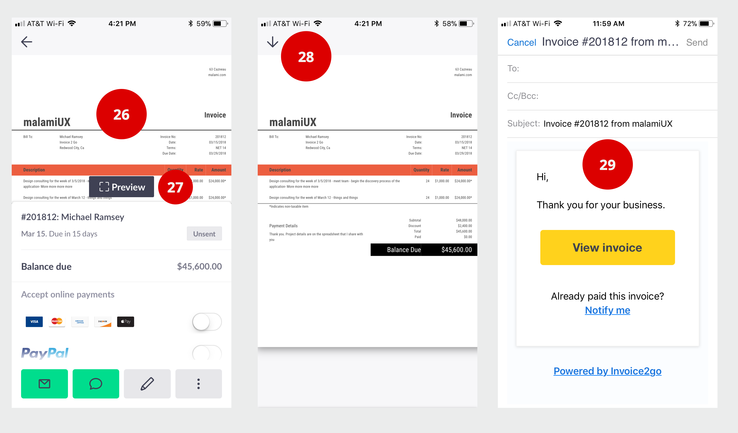
- 26 Agh. We are here again. What I want is a PDF copy of my invoice. I generally save it to google drive along with all the paperwork (agreements and forms) for each project. PLUS. I send it to the client. How do I get a PDF? I click around the bottom and I cannot find a quick way to download a PDF.
- 27 Let me try to Preview this and maybe the preview has a download or share icon. BTW. Why is this Icon (Preview) - Different than #16 Magnify Icon Why are we using two different concepts (magnify vs preview) for the same thing?
- 28 Again. The page with an invoice with no controls. The broken page. BTW. I thought this icon is the download icon. Lets stick with things people understand X to close this mode. No PDF Download here. I get the novelty - but novelty, being novel and new - is not intuitive. Considering, people are trained that arrow down is download.
- 29 Ok. Let me email the PDF - What is this? Seriously what is this? I would never stick this into an email or say this? Lots of things here - I don't want to be your brand promoter. Really, I don't. Certainly, not for a service I am paying for. If maybe, perhaps, you offer a free version and then I can probably tolerate it. (BTW. Now that I work here, I happy to be your brand promoter - I am referring to some 3rd party app that I am trying to figure out if it will work for my business.). PLUS - why would send an email to somebody that already paid me. I don't get what happens on that flow. If they did already, they will just contact me. Why do I want to send an email that forces the user to click a big button. All I want from my invoicing app is to attach a PDF and leave the rest for me. ALSO - leaving the text in a box does NOT signal to the user that this is something they can edit. Can they?
- BTW. On some other test, I did scroll and realize that a PDF is included ---- That was NEVER clear from the get go. We should make sure people can continue to operate how they traditionally operate (just email a PDF) before we convince them that a link on the page is better. Not saying it is or not - but still.
Create Invoice : Set 10
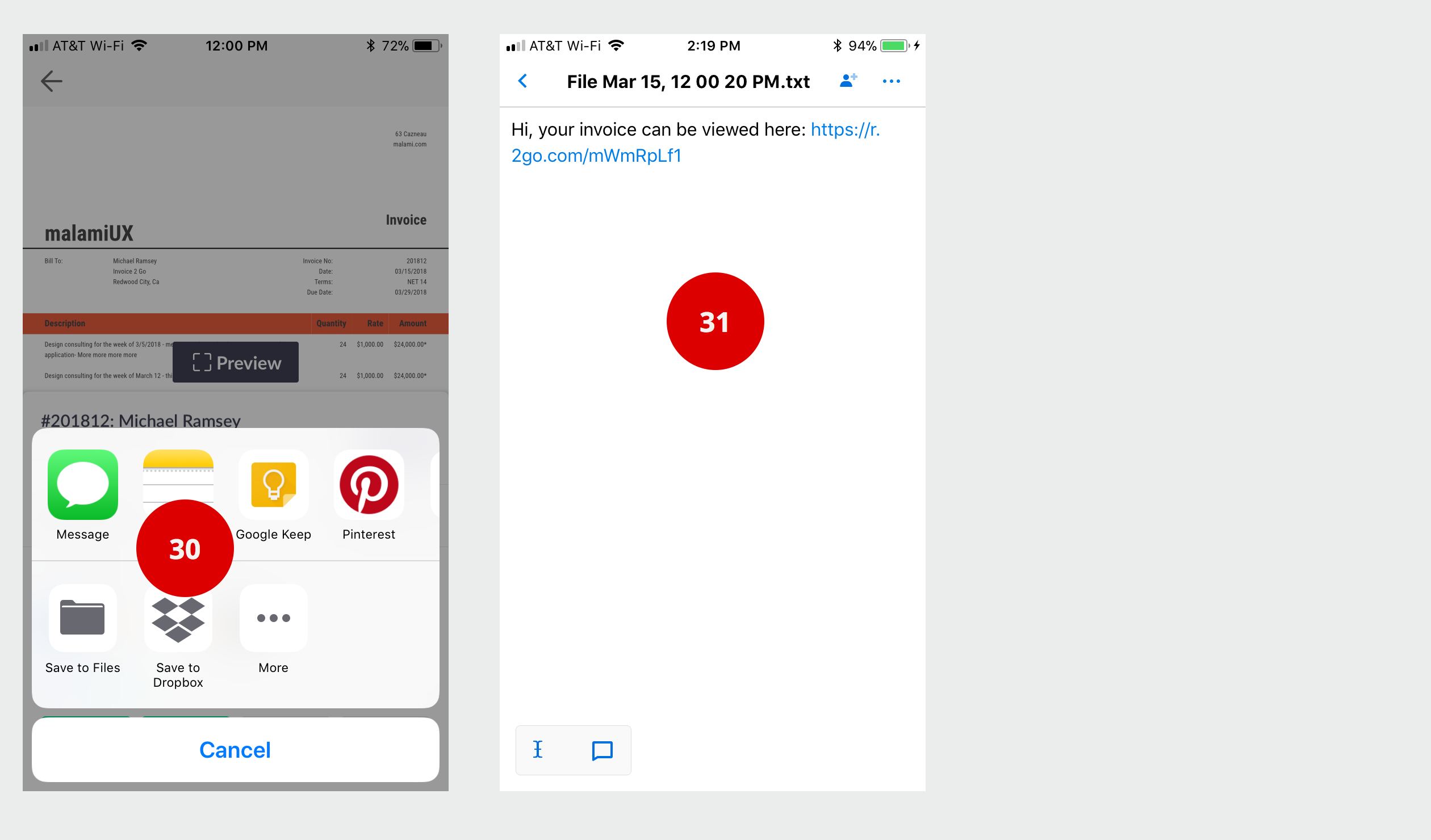
- 30 Ok. I try the share menu to accomplish my two task. Download and store a PDF in my client archive and email a PDF to client. Excellent. I see dropbox.
- 31 Seriously. A text file to dropbox with nothing but a link? This should not be that hard.
Create Invoice : Set 11
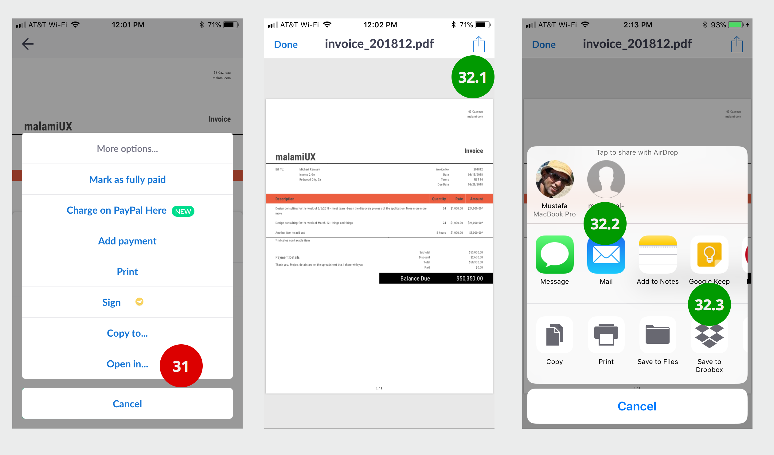
- 31 BTW. A normal user would have given up. "I cannot use this app to generate and store a PDF invoice for my normal business." But since I am here to review everything. I kept going --- So. Open In... generates a PDF. How in the world will anybody would know that Open in... is a PDF generator, I don't know. ALSO. Some bizarre bug. When I click Open In.. the slider goes away --- nothing happens -- then a spinner --- then the PDF shows up. The part that is "nothing happens" needs spinner or some feedback "working on it".
- 32 Finally. I get what I need, a PDF to email and a PDF to store in my project file.