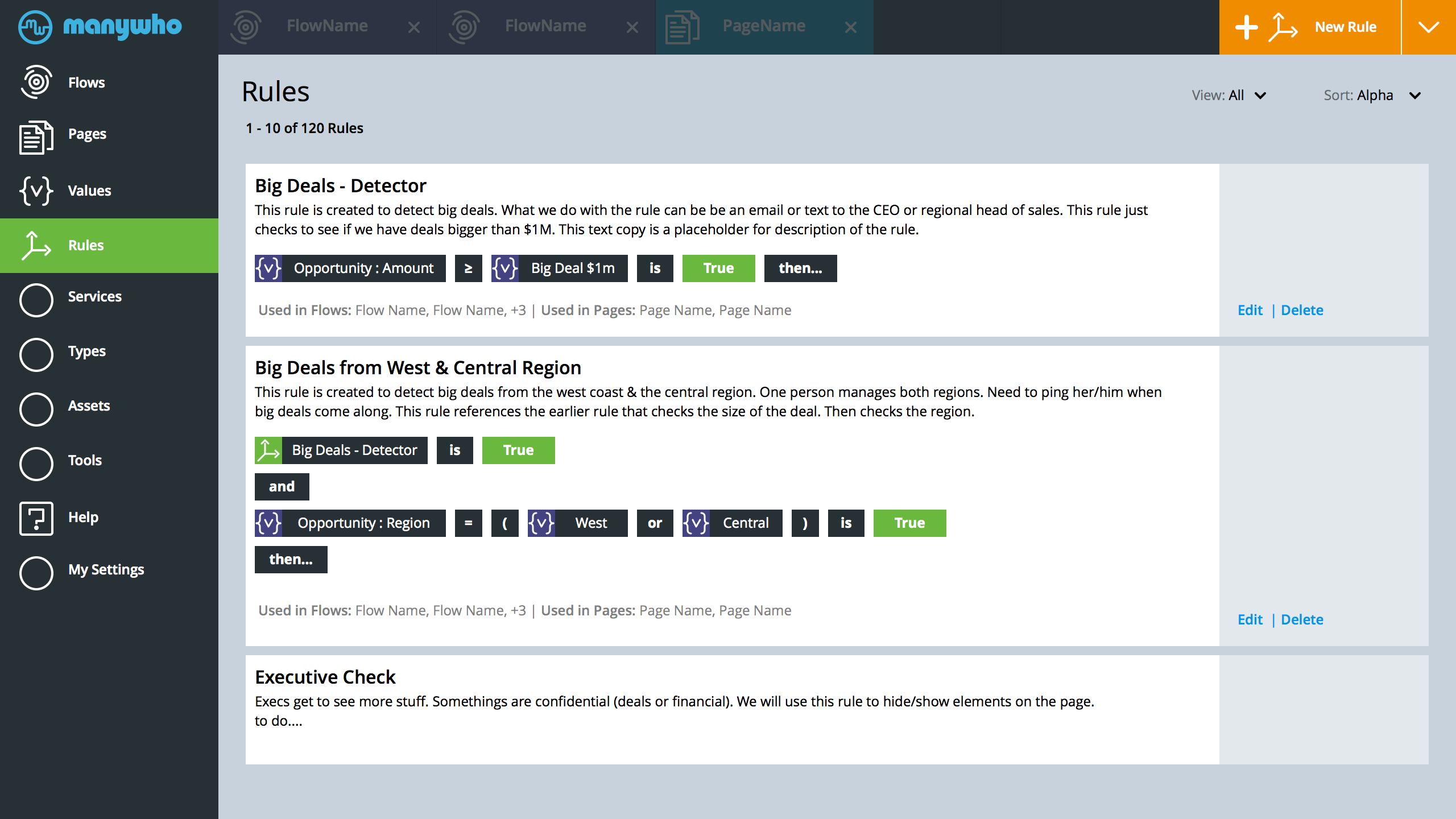
Rules Main
- The screen above makes rules a first class citizen in the application. A primary left nav location that aggregates all the rules the used throughout manywho.
- Couple of overall changes. I created a new icon for values. Essentially {v}. I needed a visual that I can reference to make it clear to the user that the rule above starts with a specific value. Also, note the icon for rules. The color for value is purple, using green to represent rule - since, we things to be true to move forward.
- The second rule on the page references the first as a start.
- This is an early draft. Need to explore the most logical line breaks. Plus, the most logical way to display the rule.
- To DO. How do simplify the creation of the rule, the visual above just shows the rule
- Some Early Questions (to solve): How do I know (as a user) That rules are applied to a page layout? How do I know that a rule is applied to a page? If the rule lister enough feedback? What visual signals do we add to the page layout that a rule is applied? How often would you re-use a rule? Can we construct a simple model to create rules? Perhaps, drag and drop values and conditions
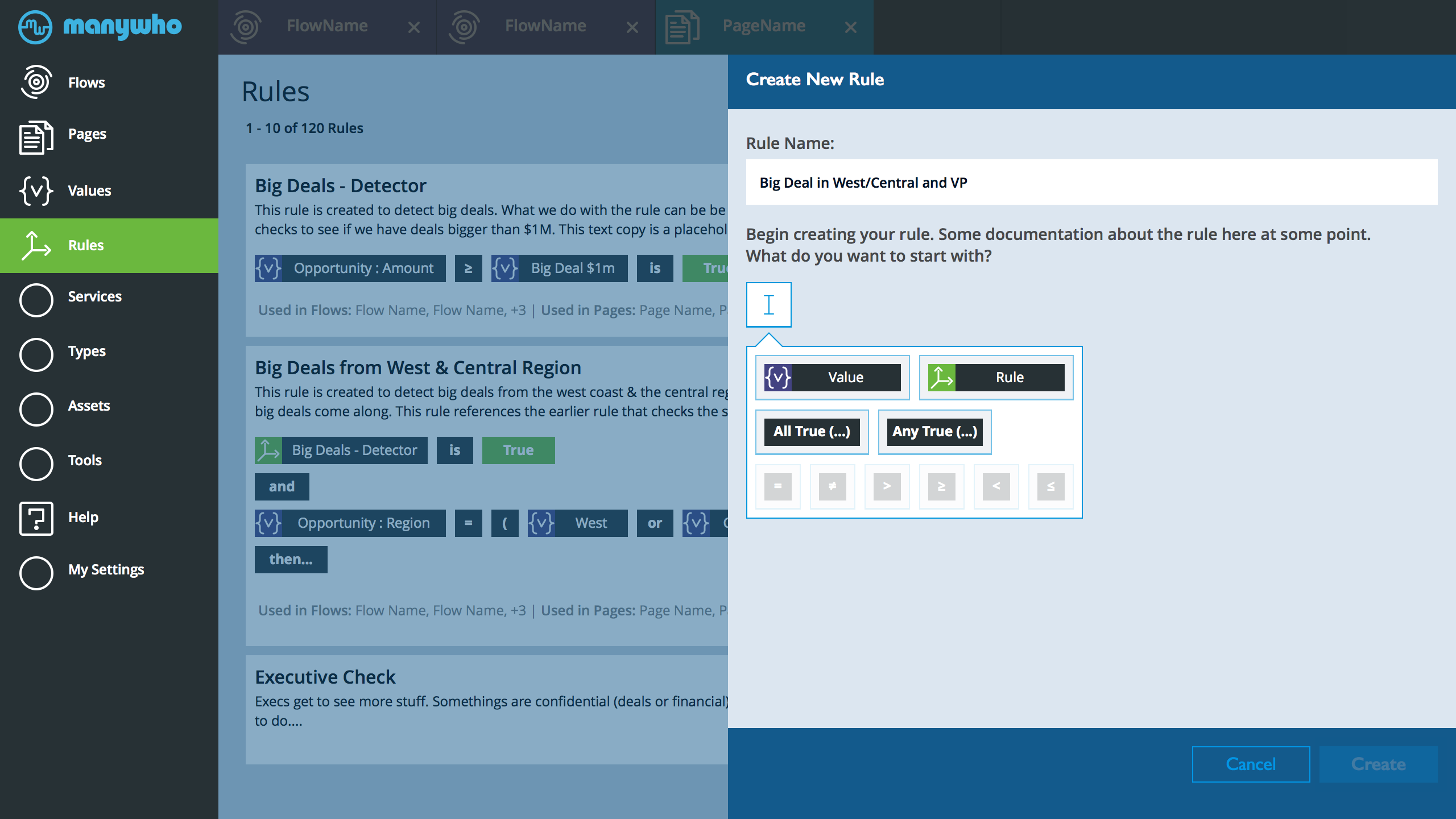
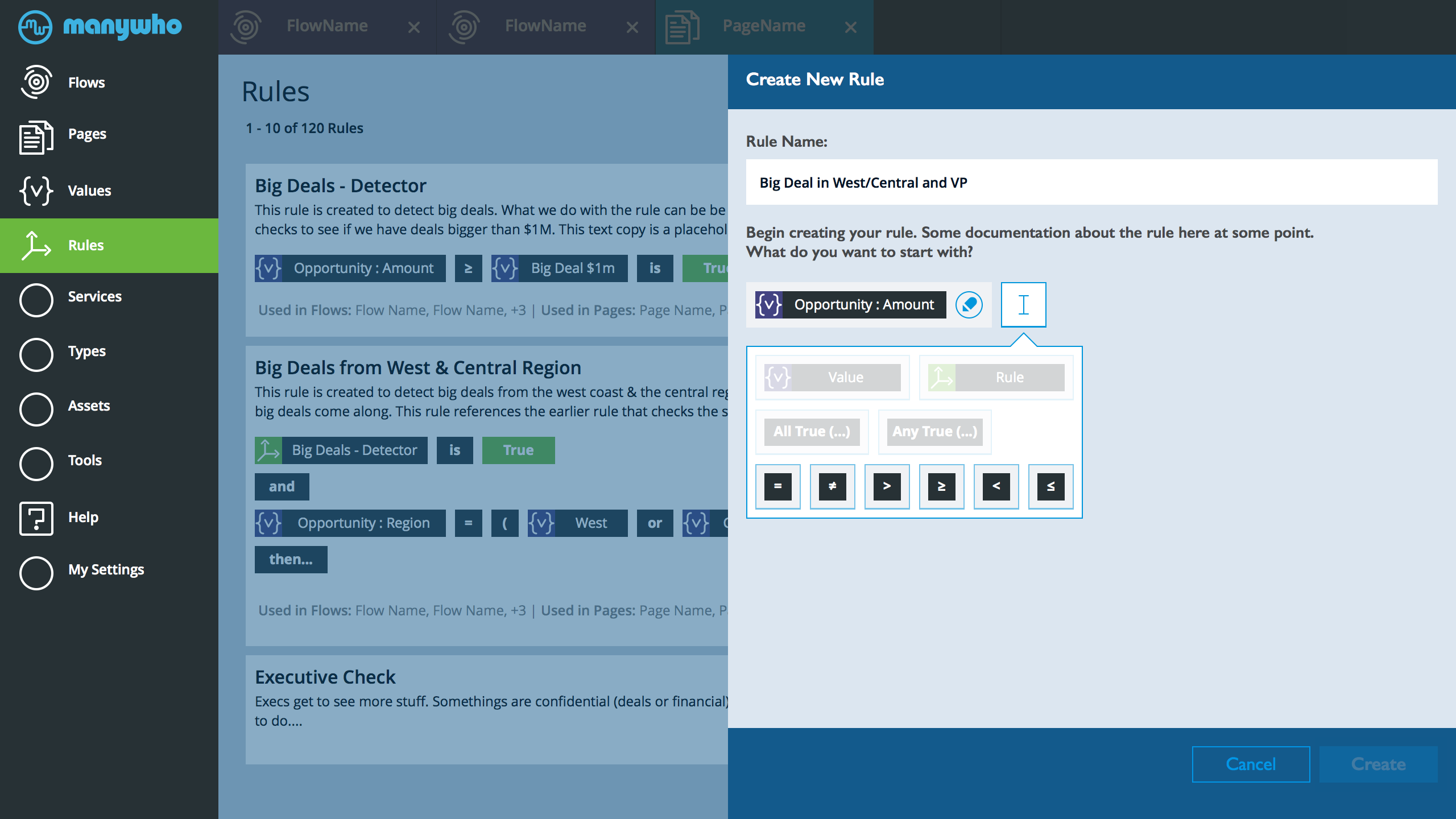
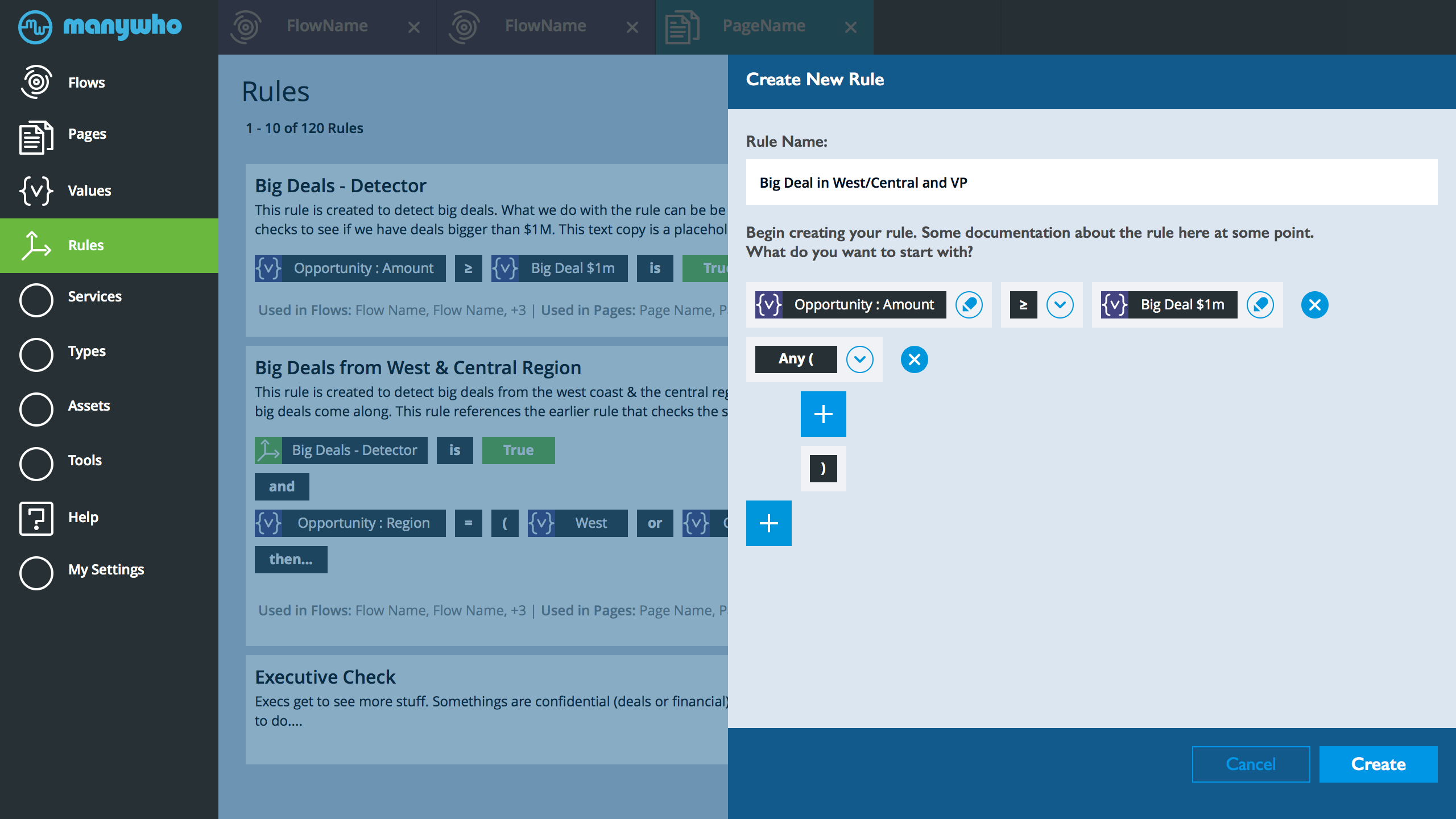
Rules Create - Step 1
- User Tap - Create New Rule and Lands Here.
- This is the default start view. The tool builder module is open and ready. Make discovery and training easier to just have it open and ready. The valid choices are on.
- In the screen above the user enters the title of the rule and taps value icon from the rule builder module.
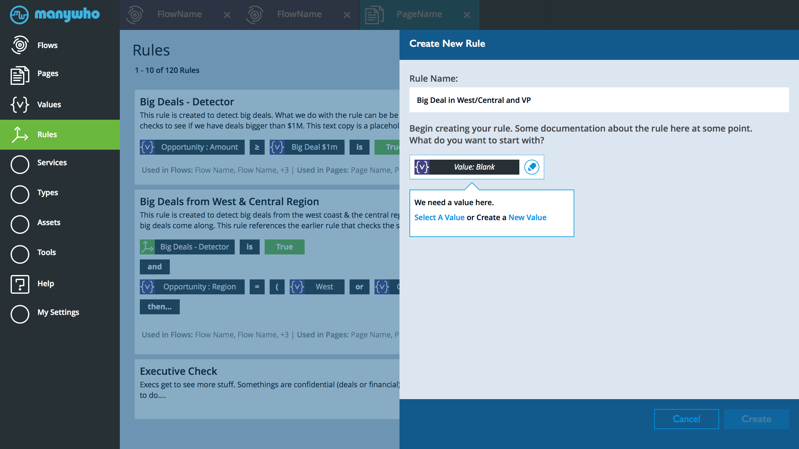
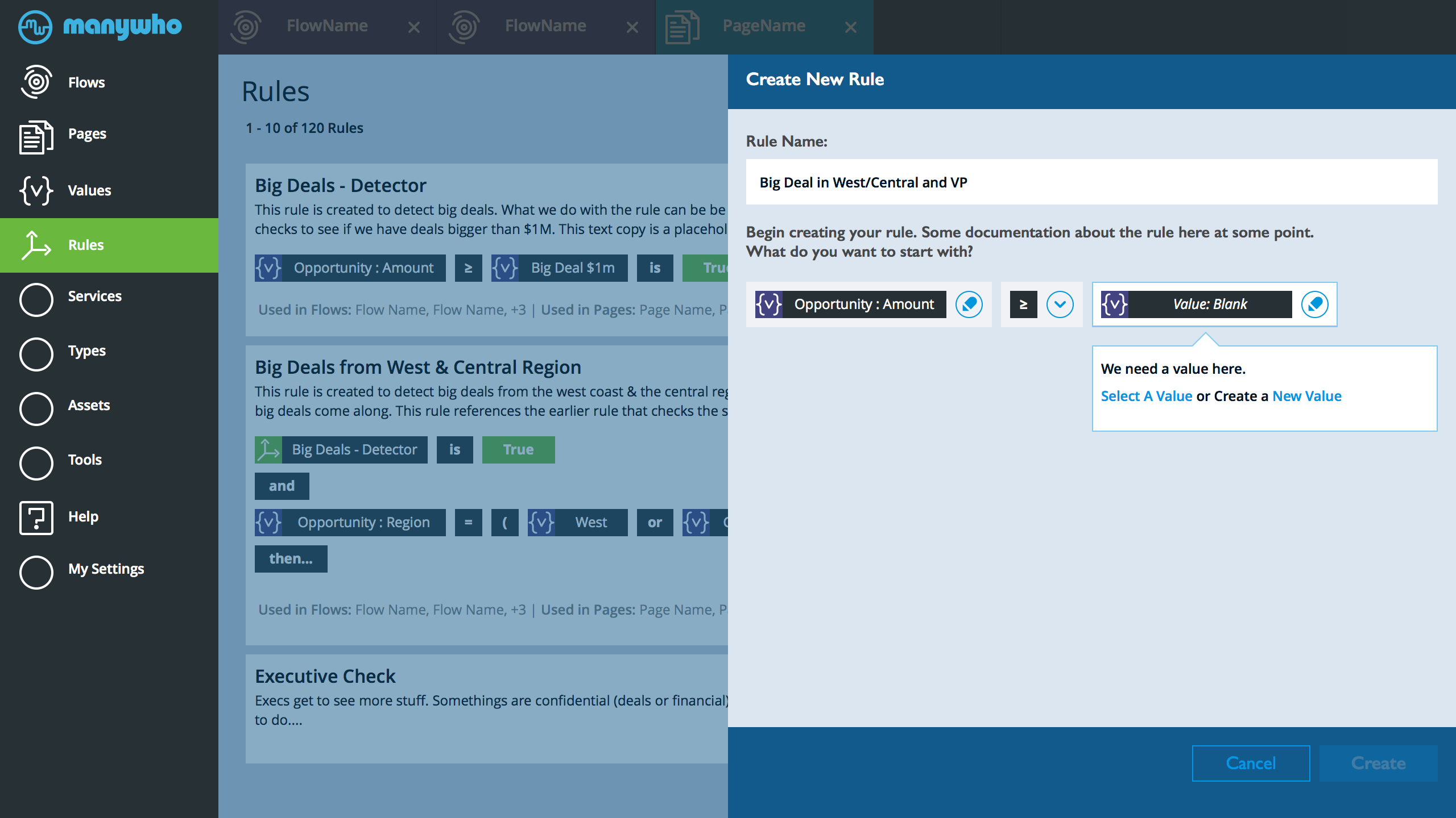
Rules Create - Step 2
- The value icon drops into the screen, with a blank. The rule builder updates and lets the user that they need to select a value before they can continue.
- Also NOTE. The CREATE primary button on the lower right of the form is dim. Until we have a valid rule in place, user can only cancel.
- User selects - to select a value
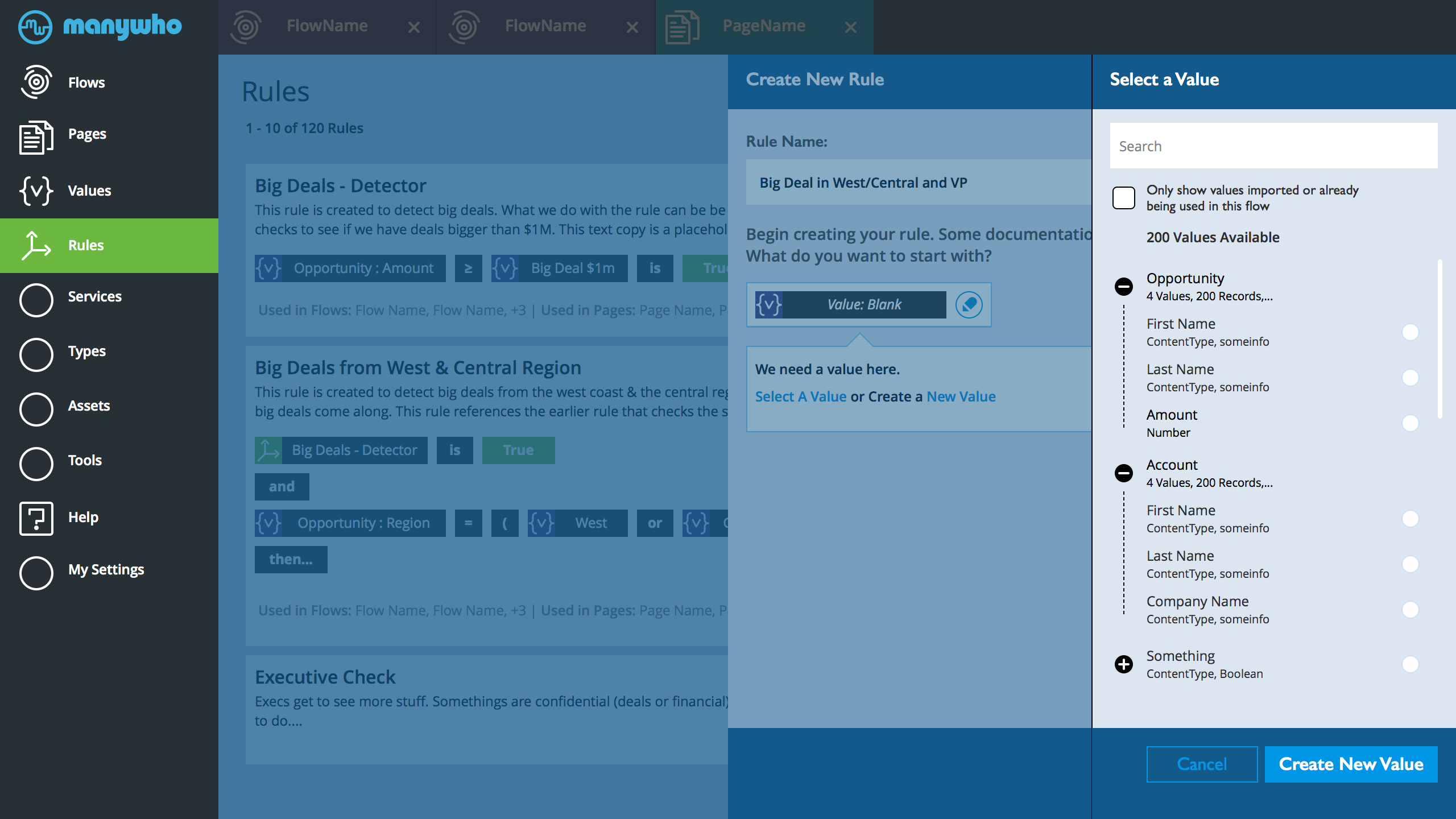
Rules Create - Step 3
- The value selector opens. BTW. This is the earlier design, use what ever the latest state is.
- User selects the Amount from Opportunity
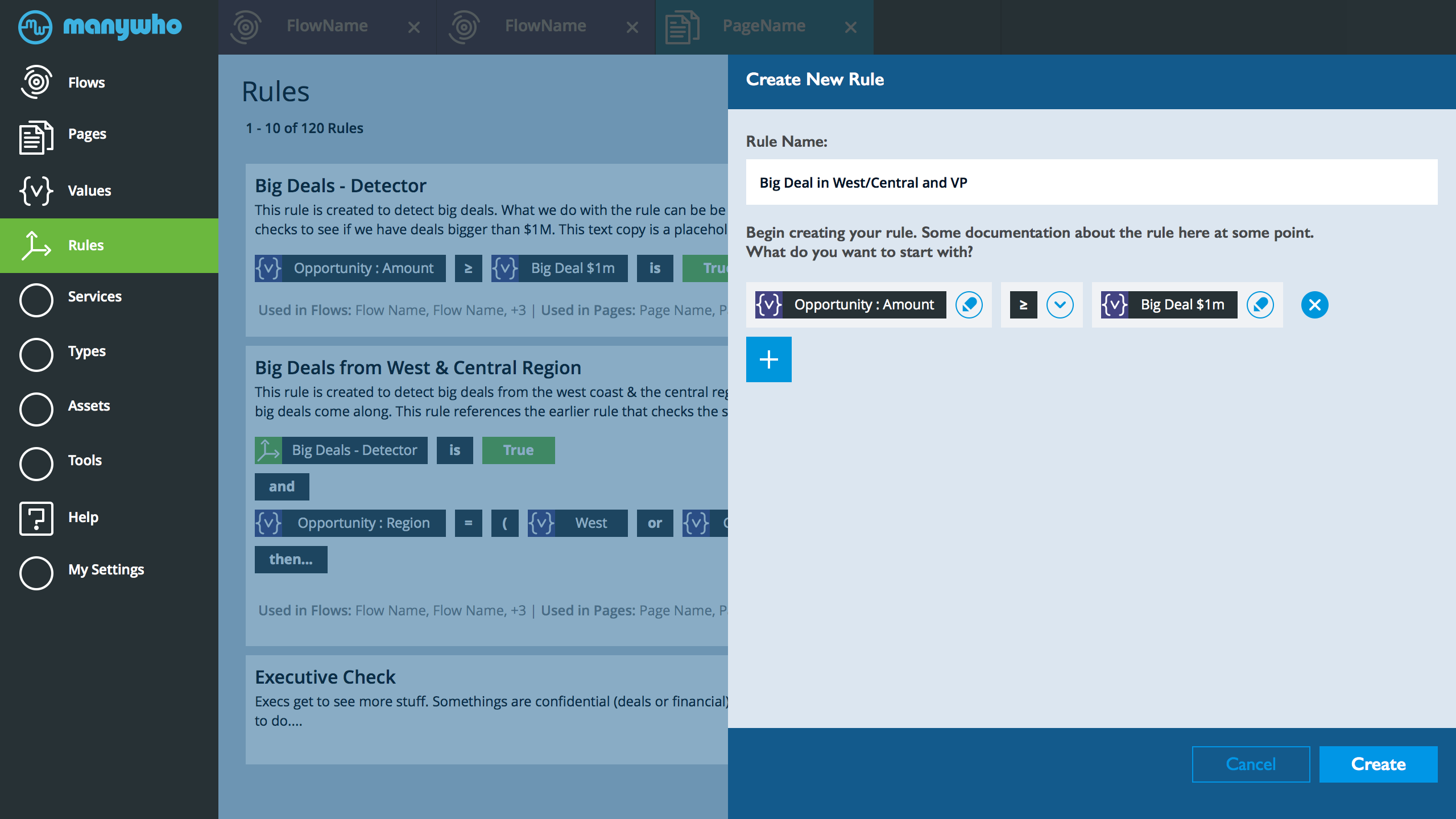
Rules Create - Step 4
- The value node on the form updates with the latest.
- We automatically, move along to the next phase. Open the builder and only show relevant icons.
- User selects greater than or equal
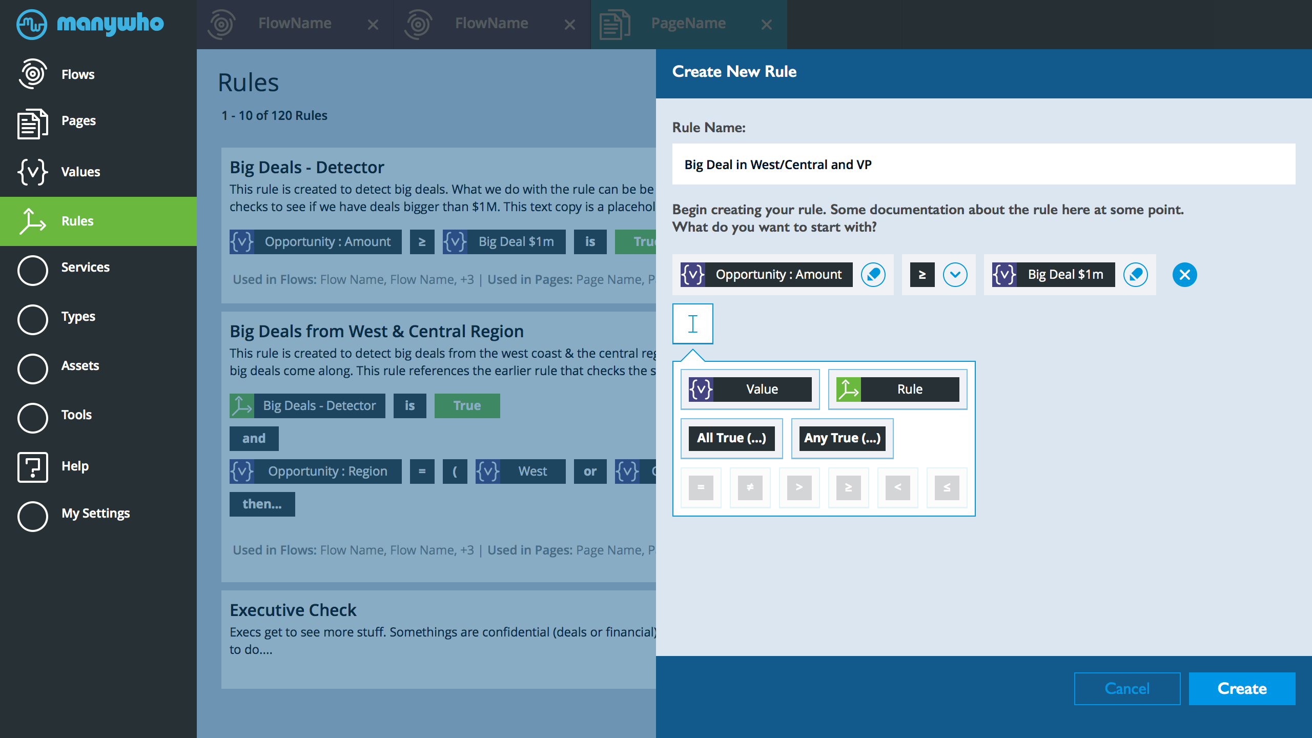
Rules Create - Step 5
- Since the only valid option after the greater than or equal is another value... Automatically drop the value icon and jump into asking the user to select a value.
- Imagine they went through the earlier process. Value selector comes in, users select value...
Rules Create - Step 6
- Now that we have a valid and complete rule in place. The CREATE button is ON and the user can tap it.
- User can also delete what they did. The x deletes that statement
- The the rule builder module is in a closed state here. We want the user to click it and let us know that they want to add another rule.
- They click the + sign to add another rule
Rules Create - Step 7
- Here they select ANY True from the list of valid options
Rules Create - Step 8
- We now have a fork. User can add a rule into the ANY parenthesis. OR user can add another condition.
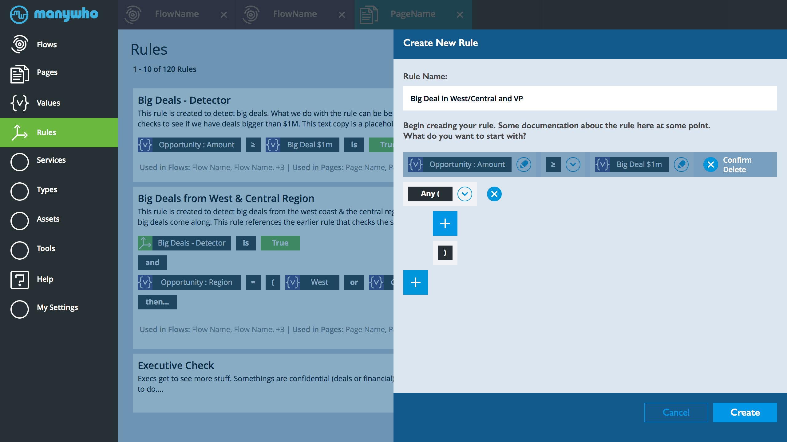
Rules Editor Delete
Another example
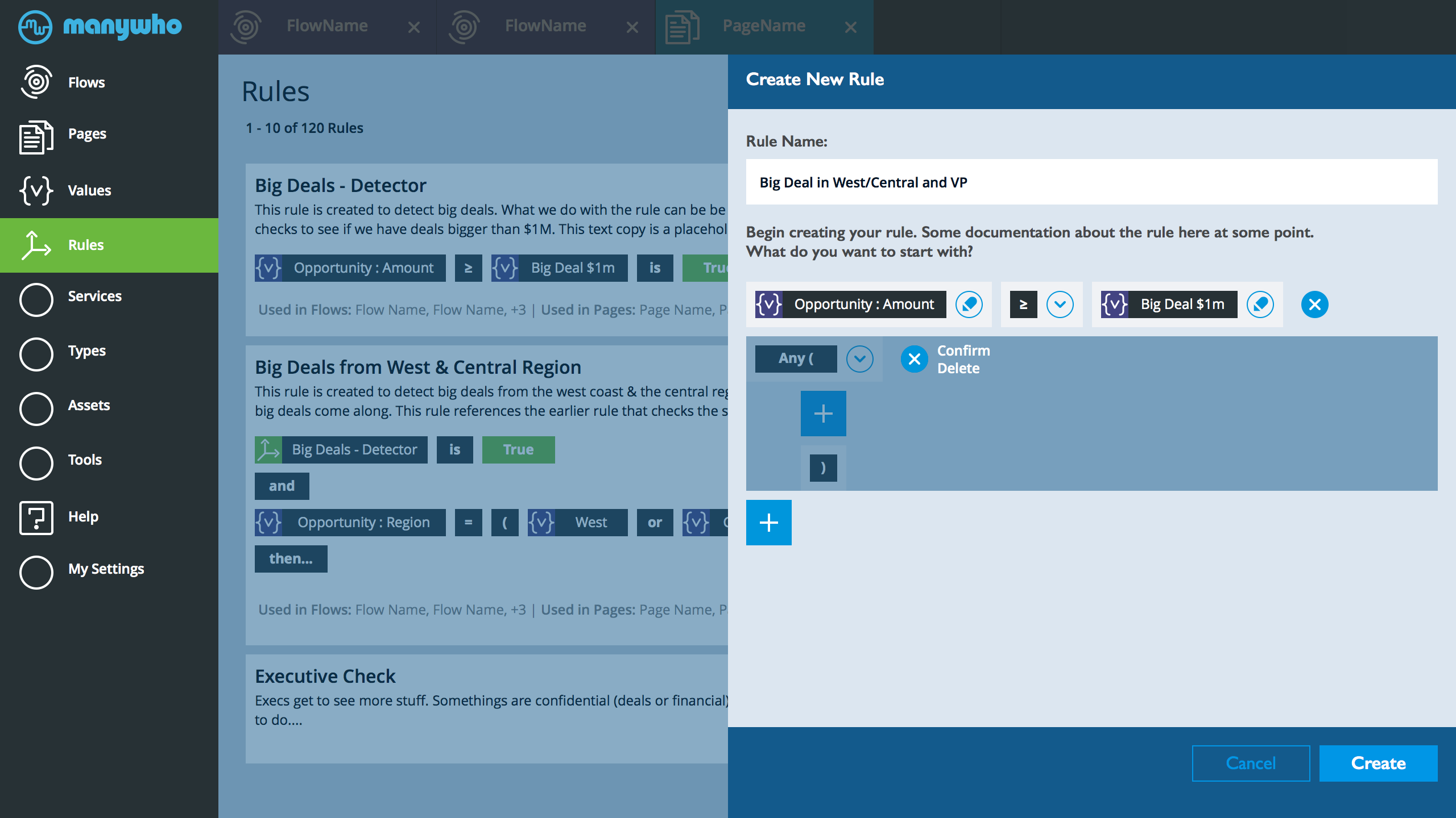
- When user is in the rule editor and they need to delete a block. They tap the x at the end of the block. As soon as they tap it, dim the section that would be deleted, then ask the user to confirm by tapping again in the same spot. If the user taps anyplace outside the block then they cancel the delete.
- Essentially, a delete is a double tap on the x. Tap once and we tell the user what gets deleted. Tap again and confirm.
- In the future, might consider undo.
- This seems like the best balance between preventing stupid frustrating mistakes without making it interrupt obnoxious
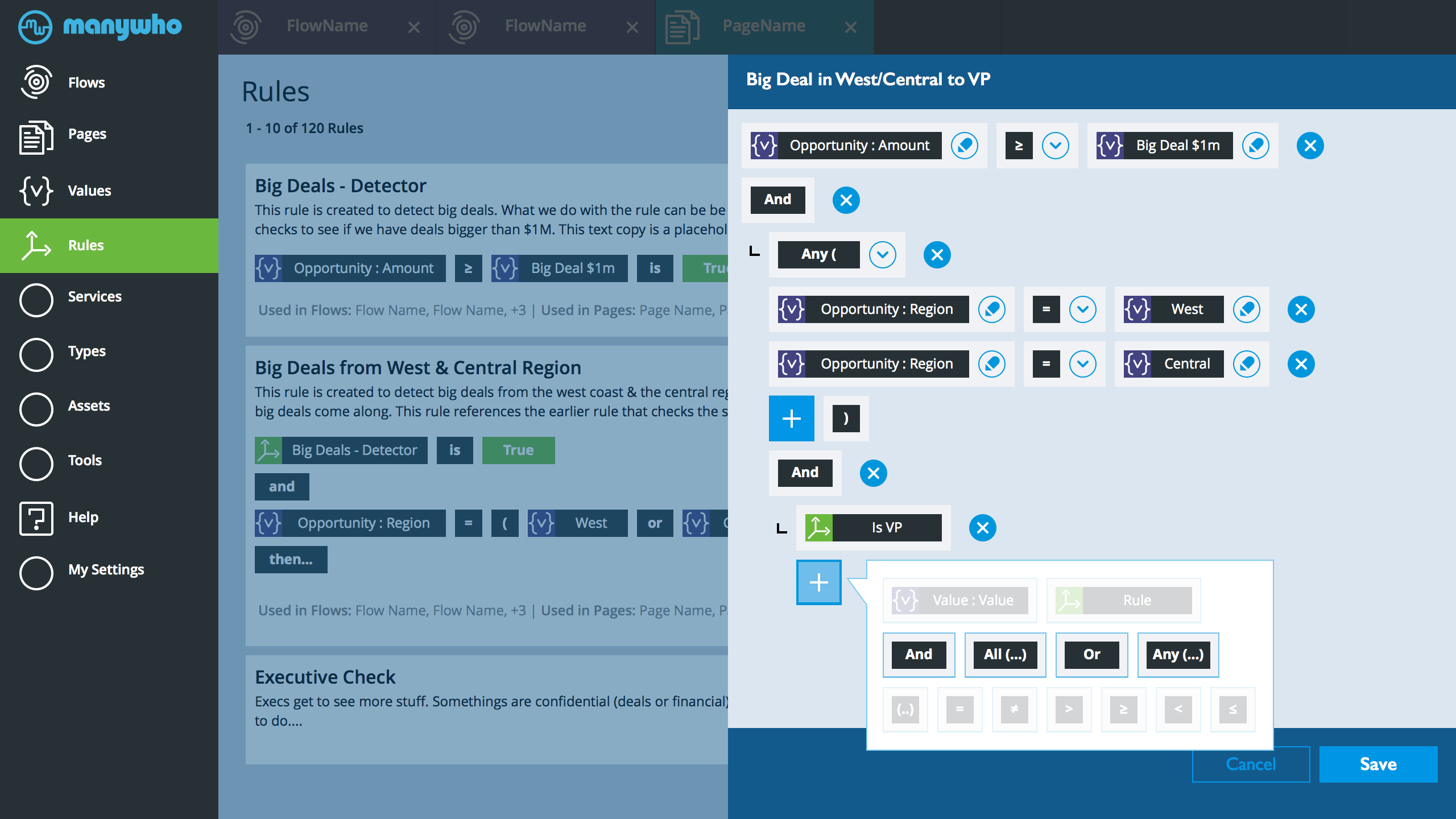
Rules Edit v1
- Note: this is very much a draft, still exploring ideas. Lots of details to finish (before and after this screen)
- The screen above diagram the process of making and/or editing a rule. This was initiated from the rules main page.
- The user needed to make a rule that does several things. 1.Identify deals that are larger than $1m, 2. Find out if the deal is from the west or central region. 3. Reference another rule that checks to see if a user is a VP. The rule will be used to kickout emails to VPs about specific regional deals or show a list of deals to the VP.
- The title of the rule was already created.
- At this specific point. The user can add and AND condition to the rule at the bottom. OR they can add another optional region to the Any (condition).
- NOTE: After much thinking. I added All (...) and Any (...) as a quick way to add nested branches. All(...) is, all the following need to be true. and Any (...) is any of the following needs to be true. I was thinking through the task of adding open parenthesis then OR with every value check and it seemed way too consuming and error prone. Wouldn't be easier to drop an ANY(...) and that automatically adds the parenthesis and user adds lines. Anyway - happy to discuss this more.
- The goal of this design is to guide the user (essentially, stop stupid mistakes). The option selector of what can be added at any given point dims and shows valid options
- This is one direction. Exploring other options
- Once saved. The control to edit and remove things go away from the main rule list view
- Something to explore. When adding the [value:value] node. The user needs to do 3 things (value, equal, value ). Need to take the user to another panel for all 3 OR I do them here. OR some combination. First time on a separate panel but the edit can be done individually. Will work on the alternatives next. NOT sure on what is the best option.
- Not sure about the ability to shuffle the order of things. Could get really messy. Left it out.
- Nice to have... When we hover over the delete (x) we background change (dim) the region that will be deleted
- This might be tricky to develop. Happy to work on alternatives
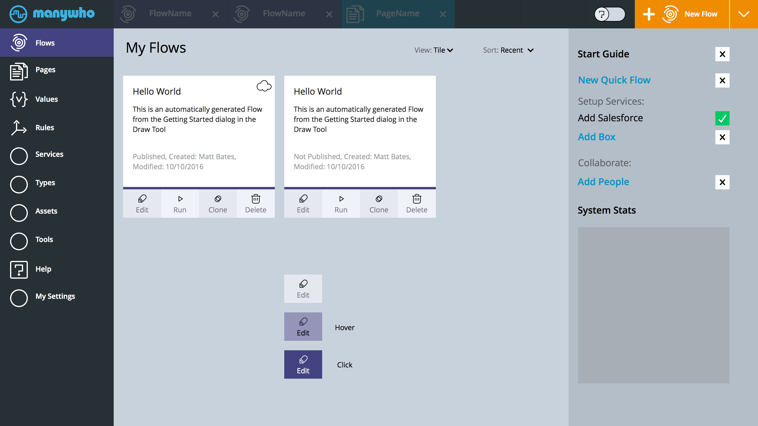
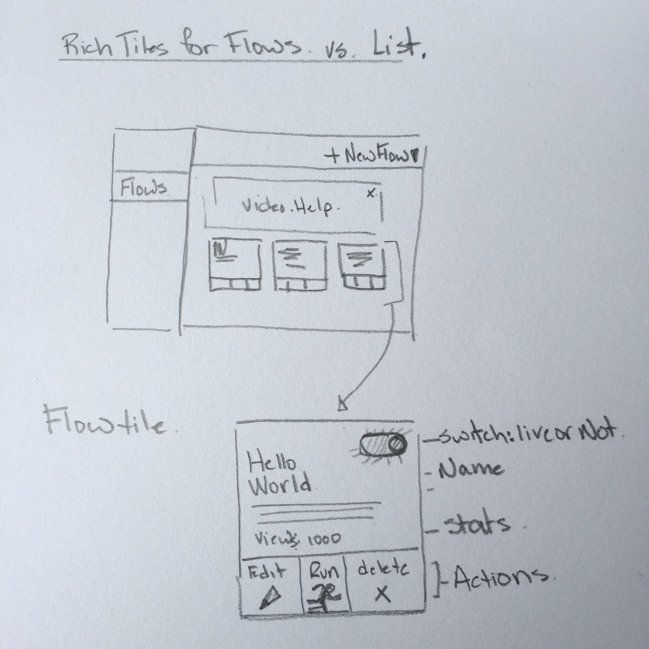
Flows Main
- NEW: Tiles updated. Moved all the tile controls to the bottom of each tile.
- NEW: Moved the delete from the top right to the control strip, consolidating the actions
- NEW: Using the top right of each tile as a status indicator... Perhaps: Cloud is published and active and no cloud. Not Published. Maybe in draft.
- NEW: Worked on the buttons state.
- NEW: Frequently requested item. Who created this, when was this modified... Some info to let the user know.
- To Do: Stats. Can we show some stats in the tile? Simple as a counter - number of times this flow was used. Sense of activity. Could be, number of times run? Is this even active? Is it in draft
- To Think: Do we need created and modified date or just modified
- To Explore: Do we need who create and who edited last. Or just the last person that touched this.
- Don't think we need search. OR. downplay it. Tiny icon that kicks in after 20+ flows. People expect to search components, elements, pages, diagrams, help ... everything. Anything less than everything and super fast is .. meh.
- Since we will have a persistent expandable tab structure on the right, we don't need the Home tab on top. Just tap Flows.
- Multi purpose right side panel
- Right side panel to incorporate elements that need to be done to get up and running
- Right side could also include (in the future). Things like stats on my apps, perhaps notifications, system messages...
- The landing experience would also include any tabs I have open, things I am working on
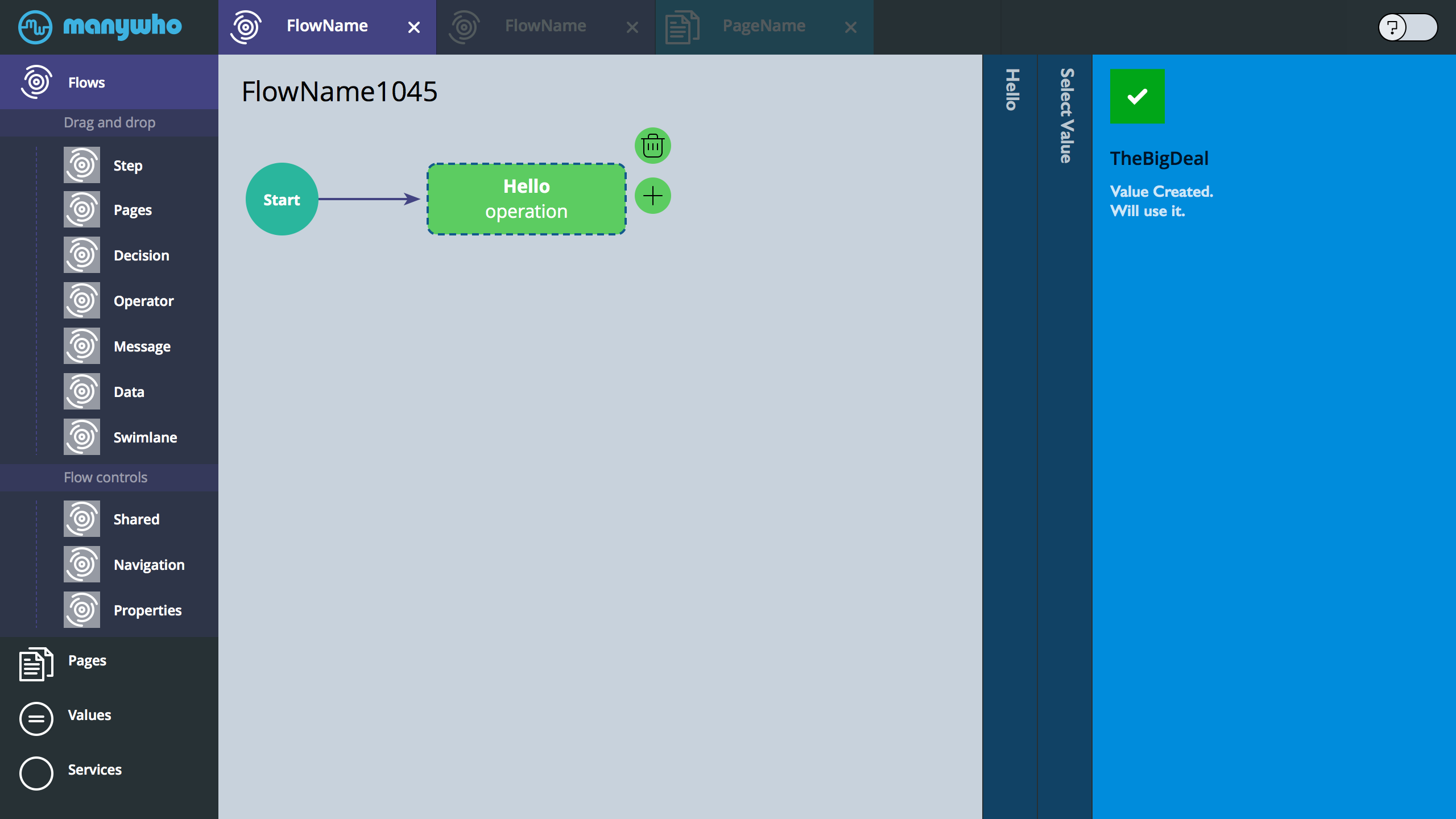
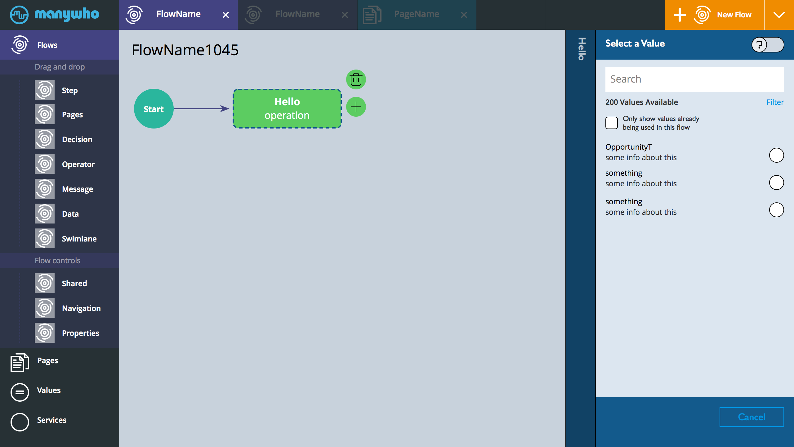
Value Selector v3
User needs to select another value. Taps arrow on the value select rich button
Value selector opens
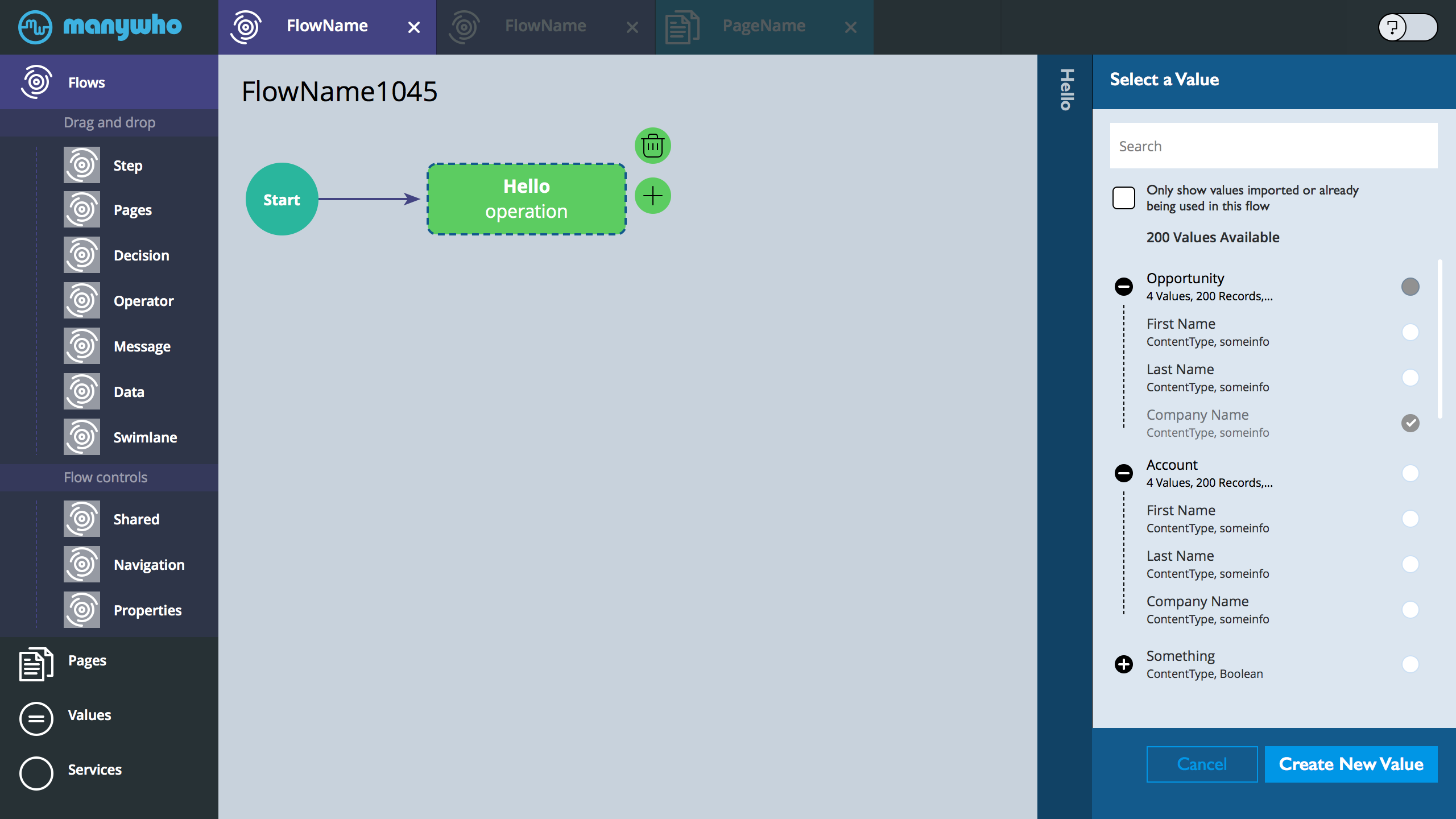
- The value selector has open/close objects.
- Clearly gray out things the cannot be selected
- The footer of the value selector now has the ability to create a new value
- The moment the user selects something the panel will self-dimiss
- Note: the only show value check box is sticky to the flow. Default initial: unchecked. Also - reword to include the concept/word import.
Decides to create a new value vs select one.
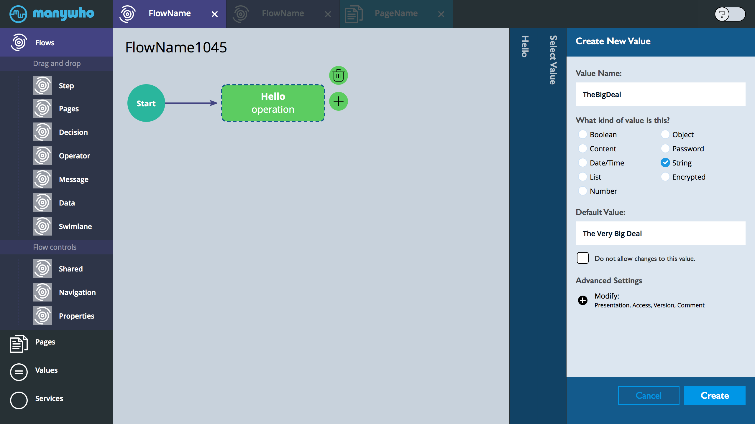
- Note: moved the do not allow changes to this value under the default value - seems to make sense vs it's own lingering component.
- Also. the advanced setting hints at what is advanced.
Some colorful confirmation update. Hold then dismiss.
- Tell the user we created it and we will use it
Back to the panel that launched the selector

- The RICH value button icon changes to modify state.
Value Selector v2
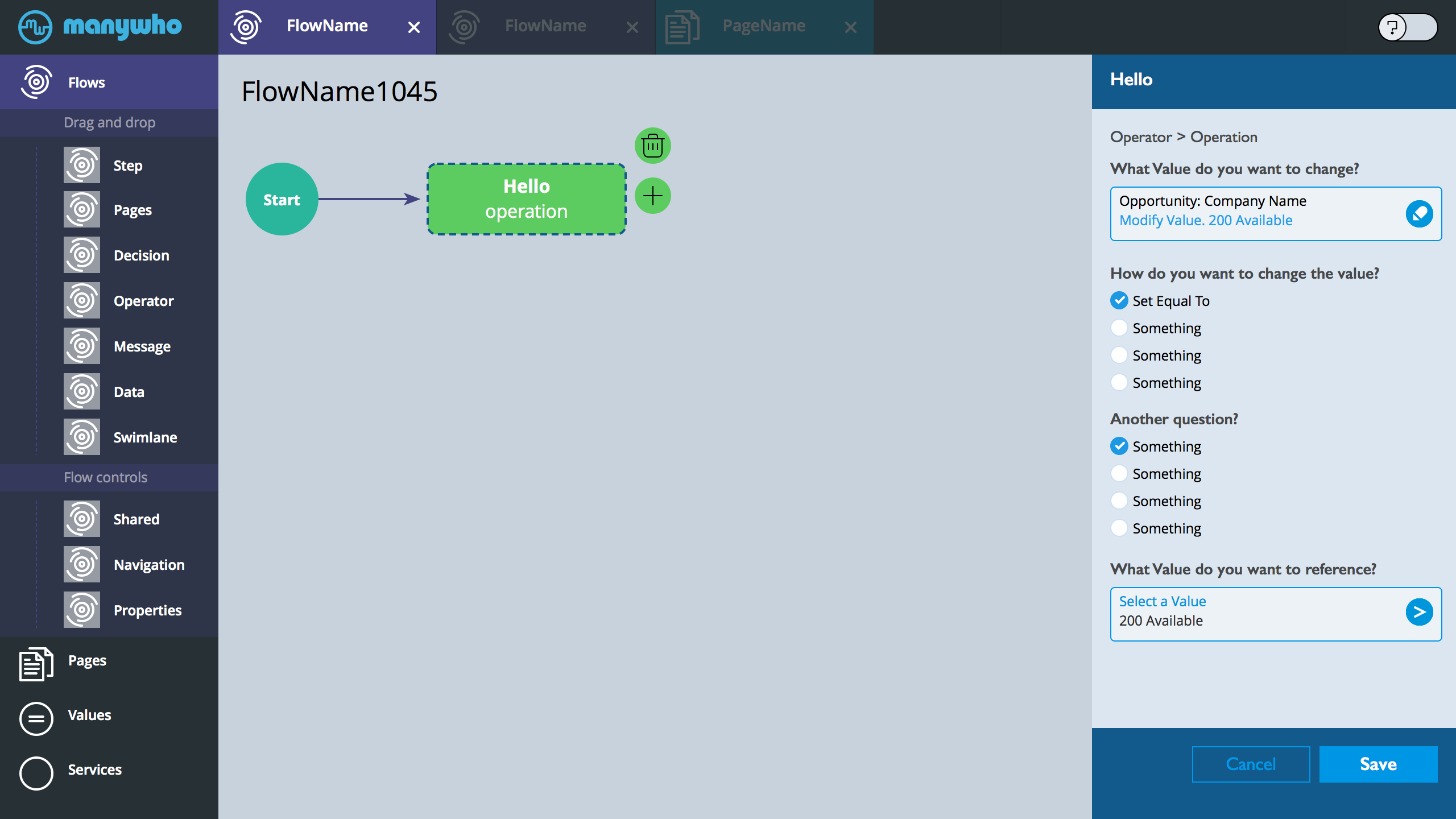
V2 explores a way to kick open a value selector while we keep the primary task on the screen.
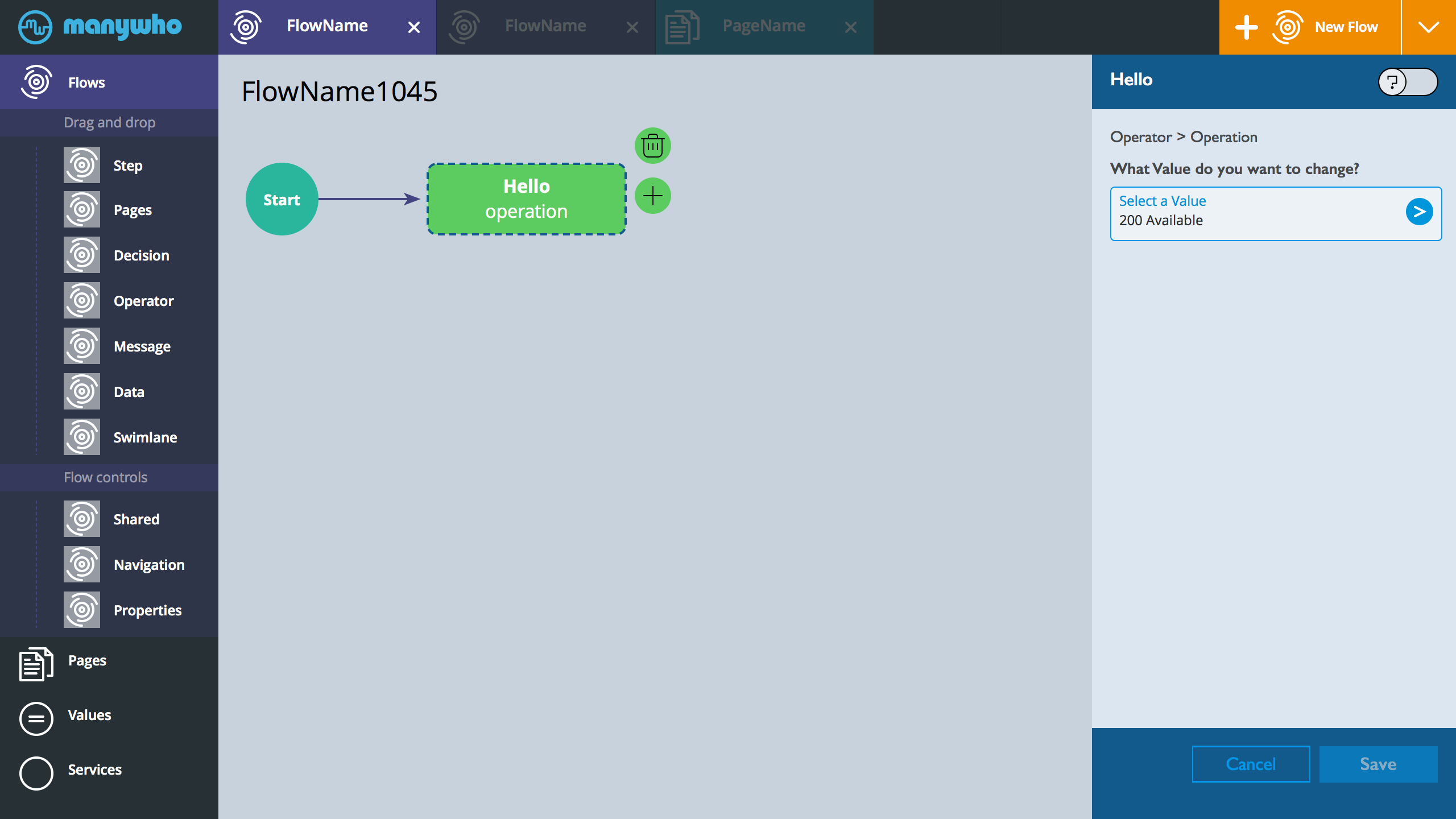
- User taps the Select Value inline Button. The button is a rich button (letting the user know that we have 200 available options).
- Once clicked, the value selector slides into the screen
- The button that was clicked to slide open the panel now has a x mark. User can tap the button again and close the selector slider
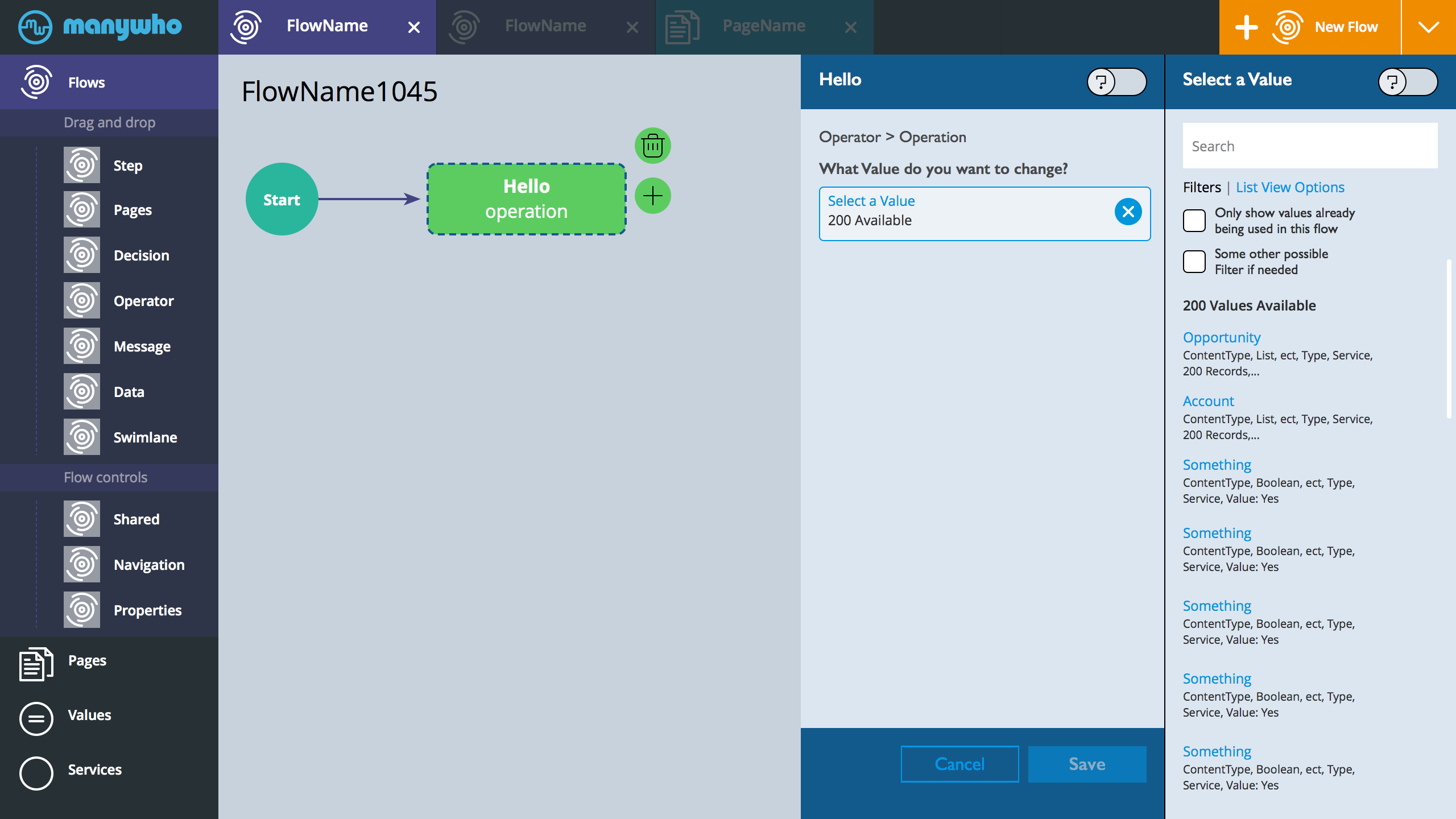
- On the slider. We expose any filters. We also can toggle the between filters and view options. View options lets the user fine tune the specific meta information they need to see in the list of values. It would be a sticky setting.
- All the user needs to do here is click some value.

- Once a value is clicked. The panel closes and we are back to normal state.
- The button that was used to slide open the selector panel, changes to a modify button. We can drop the circle with arrow (since something we really don't need to draw attention to). User can tap it and modify. Note the blue is now on the action. Modify Value.
- In this view. The user has also finished answering a couple of questions
- Another Value Selector needs to be clicked
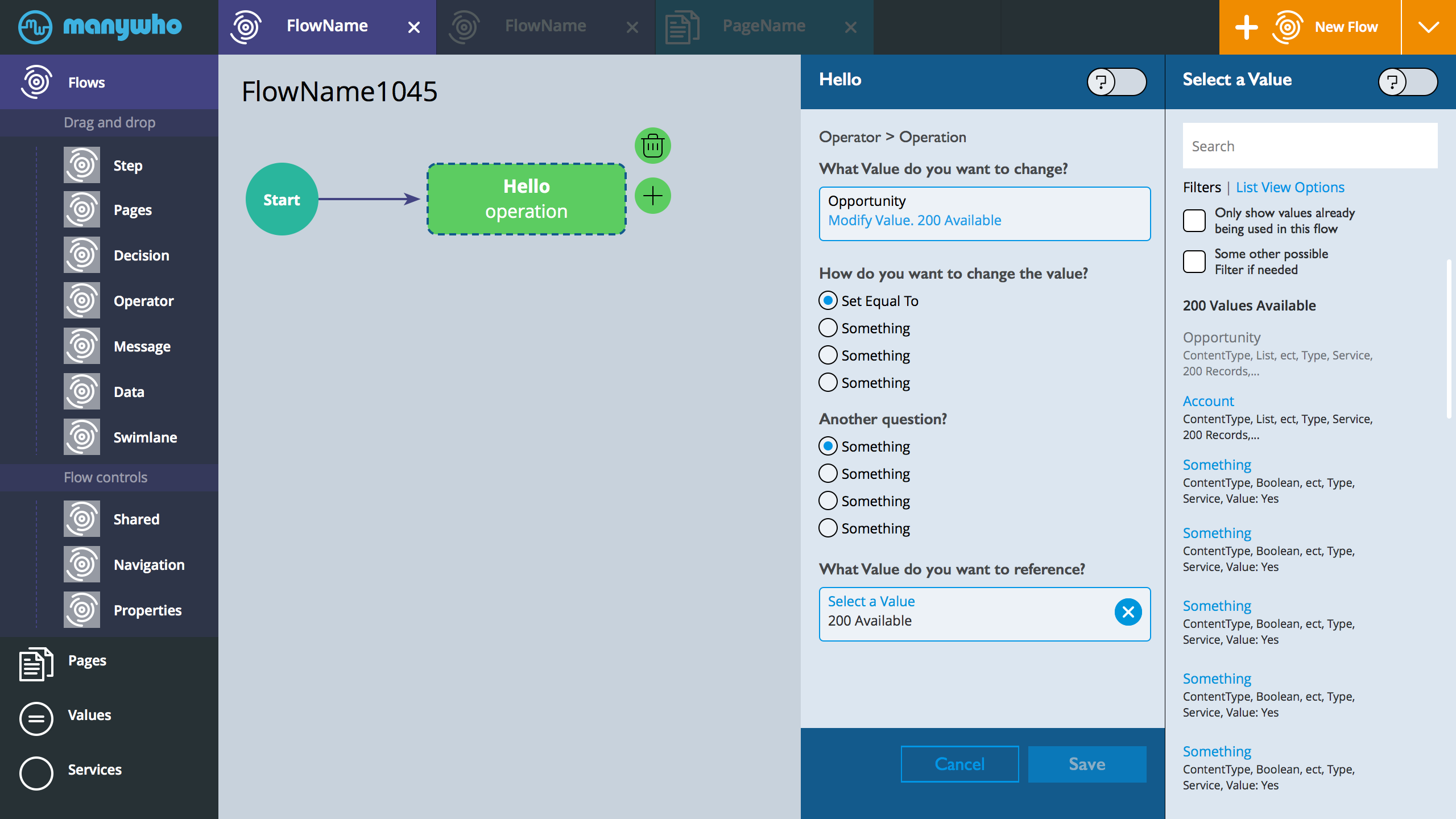
- The selector is now open.
- The main difference here is that we gray out the first value. That option conflicts with what the user is trying to do. Essentially, gray out any option that cannot be used.
- General NOTE: if user clicks to open the selector panel during modify. We should indicate (perhaps a small check on the right side) what the current selection is.
- BTW. If we like this approach, I can spend more time coloring and the new skinny selector panel
Value Selector
During creation. User adds an operation. Instead of the pull-down we direct the user to a picklist

The pick list. User gets to scroll up and down through all the possible value. One tap select then selector panel closes the the user continue with the operation editor
Values: Create New
Use Cases
- User, anticipated the need for some value, creates them and gets them ready. Now, during the process of building a flow, the values are ready and available.
- User, in the middle of building a flow, realizes that they need a new value. A value, they never created in the past. Ideally, they don't want to break out of the current flow-building experience to go and create a value then resume back to the value selector. The challenge becomes, we need a way to "park" the value selector. Then snap out, create the value, then resume.
Ideas
- 1.Universal publisher. Regardless of where you are in the application, you can always create anything. The trick will be retaining context. So create during an existing value selector takes the user back to the value selector. VS. create any other time, takes the user to the landing of the values. ALSO. This might not be immediately discoverable, need an info bubble to guide the user to the universal publisher. Need an inline tool tip.
- 2.Inline in the value selector pull-down as the first selection option. "New Value" would be one of the pull-down options
- 3.Secondary function inline within any form. Create New Value, below the pull-down
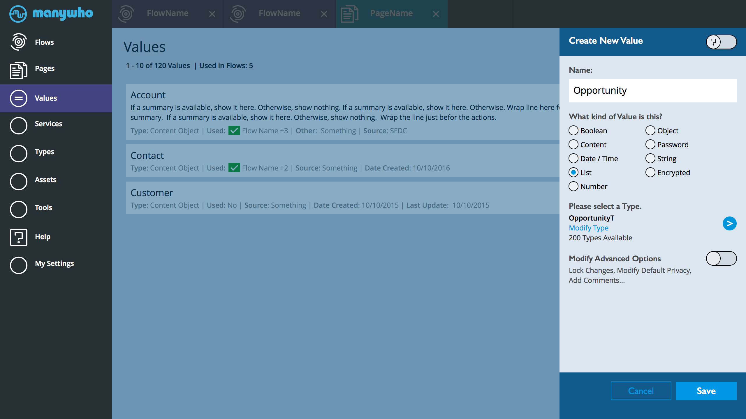
Create New Value. While user is on the main values page.
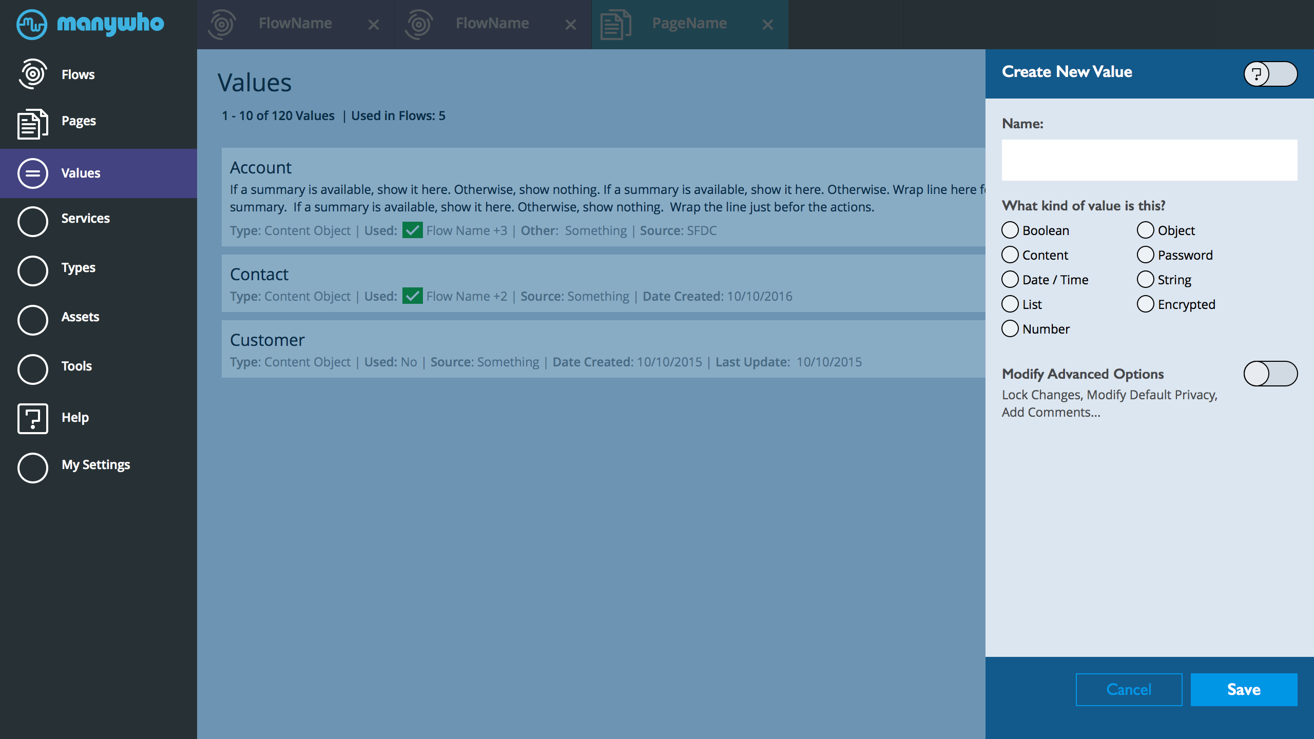
- The screen above addresses one use case, user on the main values page and decides to create a new value. They hit main publisher button to create a value. OPTION. We could drop the publisher all together when a NEW is initiated. OR we leave it.
- Since, we keep the flow on the page when we open the form editor, it might make sense to continue with that model. Keep the list of values on the screen as the user engages in creating a new value. Plus, we can leverage this skinny value create form when a user forks over a flow and needs to access the create value. This will provide some experience continuity.
- The question icon is a way to enable inline assistance in the form. It has two states OFF/ON. Once one, info bubble inline appear to explain what each section is for.
- The name is required. Plus the kind of value
- Might be better to explose the kind selector as radio control option. Make it easy for the user to see all the possible options on the screen. The pull-down requires more energy to process (mental and physical). Plus, best leave the pull-down to when we really need it. Going through a really long list.
- The last section is modify advanced option. Since I used a toggle circle slider switch to switch help OFF/ON, could re-use the same control to expose and modify advanced options. ALSO. within the advanced section, expose what items can be modified. That way, the user doesn't have to expose options just to realize that they don't need something or hunt for something. BTW. The PLUS open works as well. To expose advanced.
Values: Create New Part 2
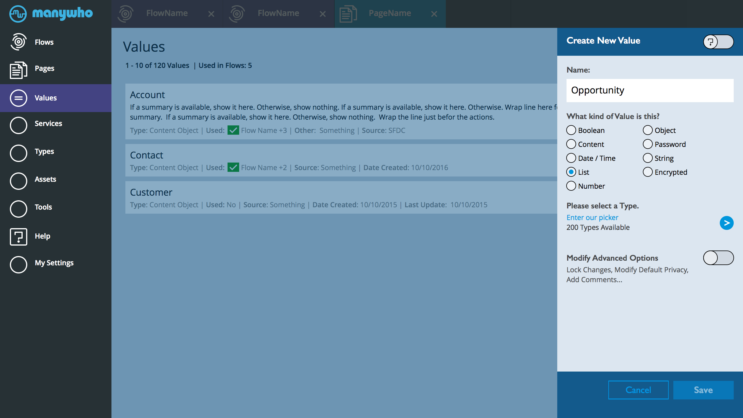
- User selects List for a kind of value
- We need to select a Type. A pull-down works if user has a few types to select from. At a certain point, a pull-down list becomes overwhelming. Suggest we send the user to a pick list.
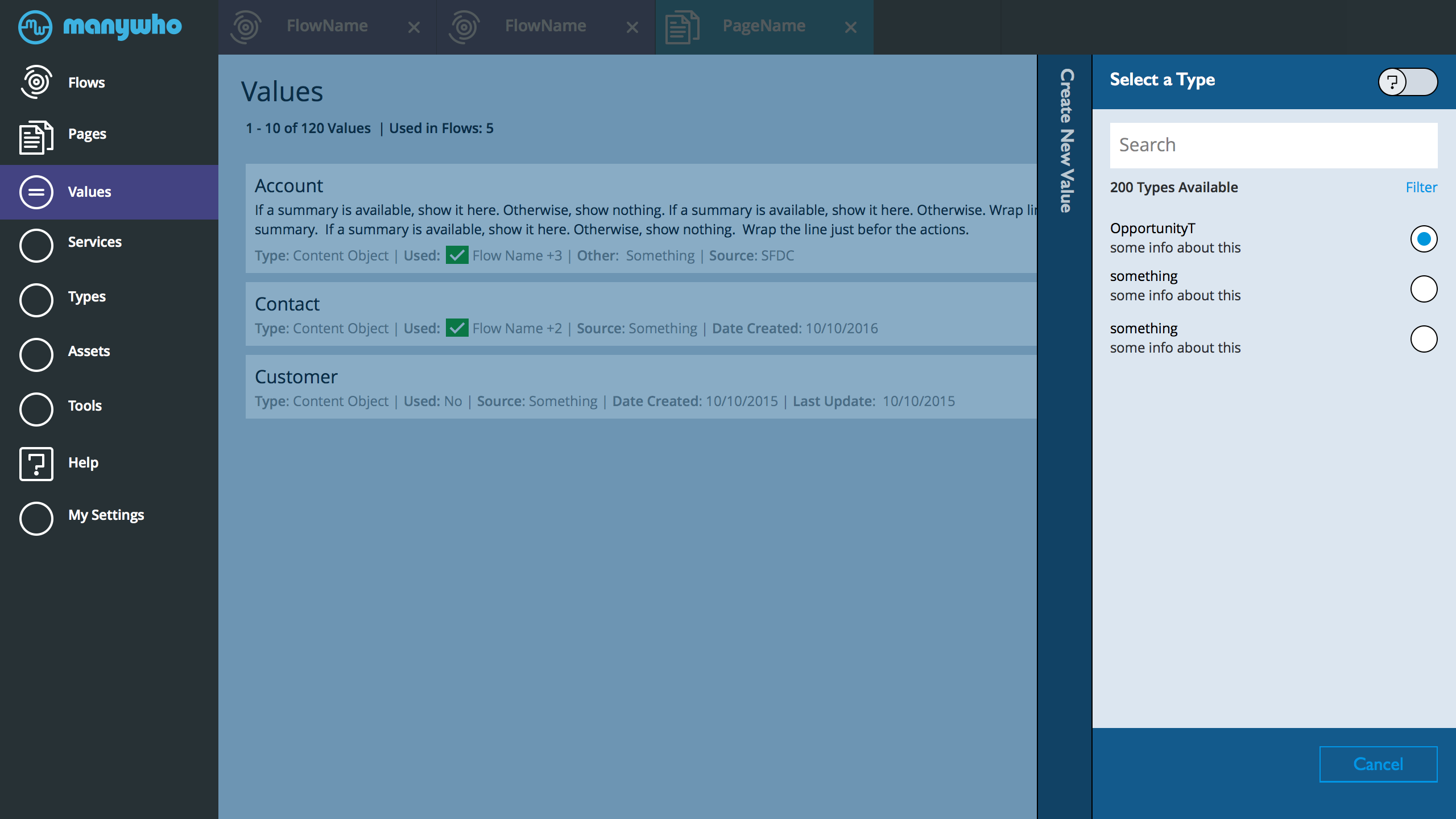
- Type picklist. A robust list with search and filter.
- One tap select dismiss
- User selects OpportunityT
- Our type is selected.
- User can now save this new value or modify the type.
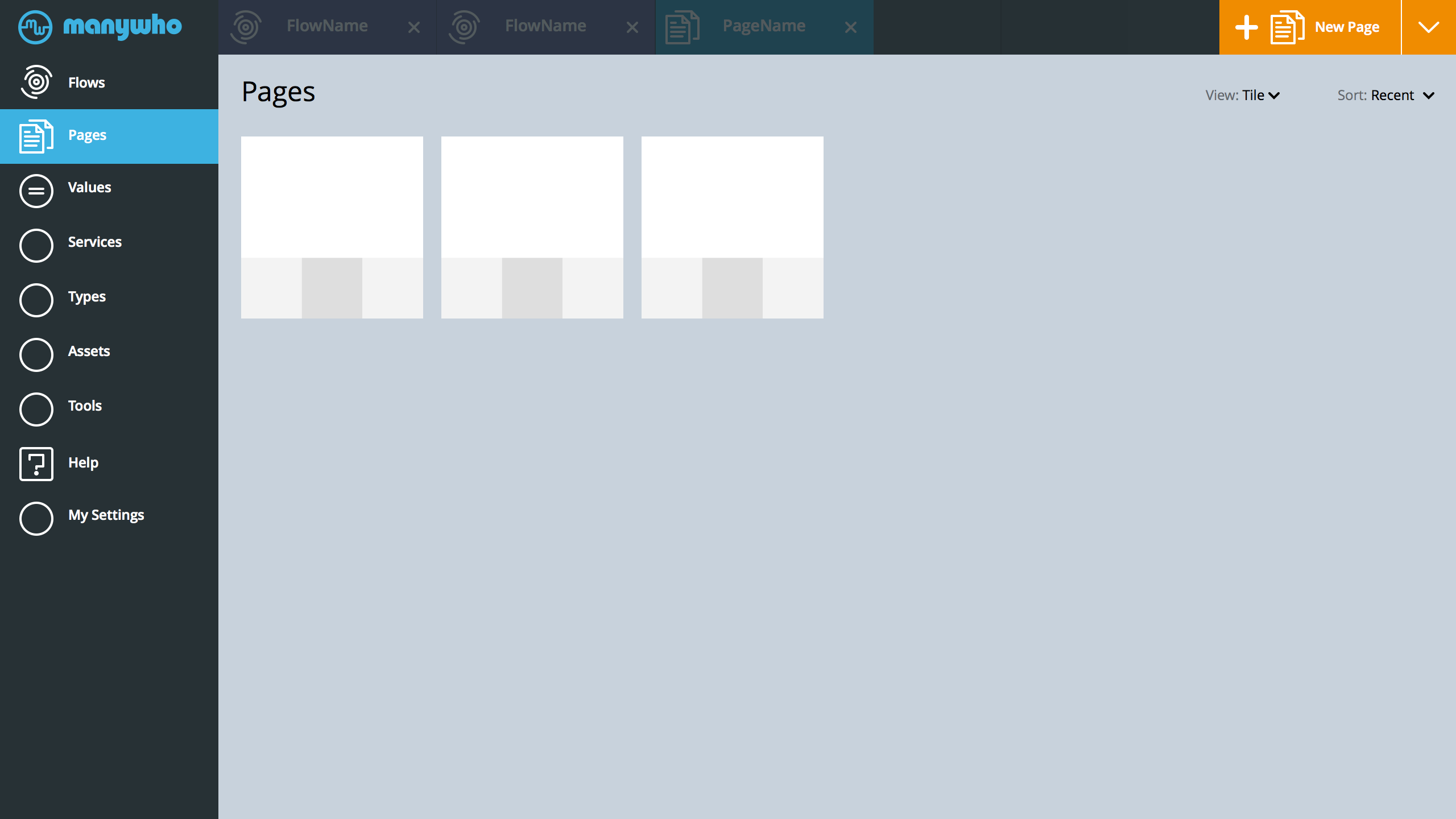
Values: Main
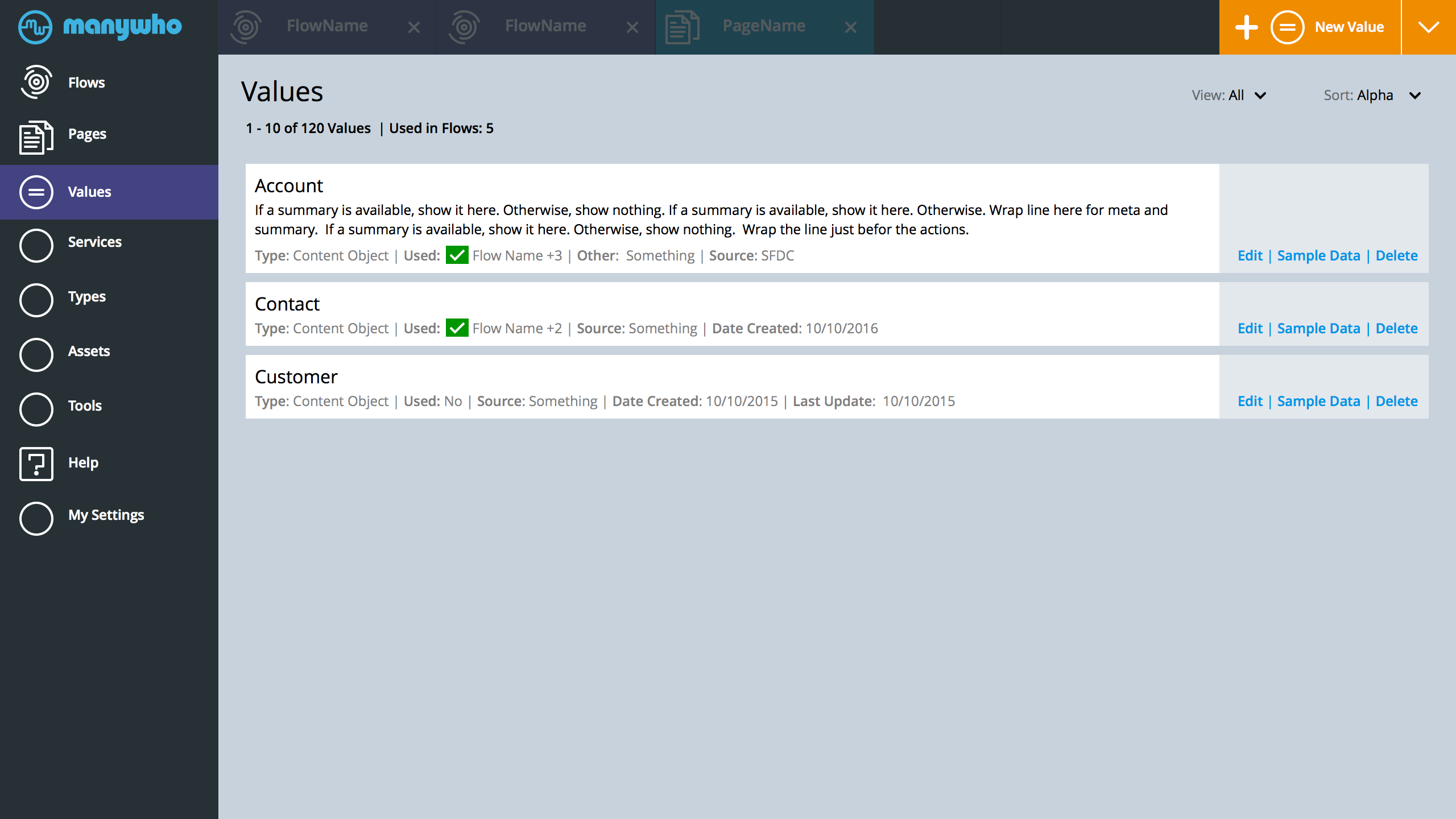
- This view rethinks the main view of values.
- Starting from the top. All active tabs dim, since we clicked the main values tap target from the left
- Heading and Left tab clearly identify where we are
- Under the title of the page values, the user clearly understand how many values they are currently seeing at the moment and how many are available since we need pagination (will include in future screens)
- The top right section of the page is our universal create publisher. Since we are at values, the default is Values. User can switch to something else and create anything.
- Under the Create Button. We have the list controls. The control manage how the list is sorted (currently, in Alpha) and what artifacts the user wants to see in the list.
- Instead of a table view, we use a more extensible pattern for showing a list.
- A clear title, space for a summary, and all the possible extra information the user might need to know about the item.
- This view does not depend on a table of columns, columns that might not have any content (example: summary). The information will efficiently fill the space.
- The view controls on top will let the user dial-in what they really need to see in values. SO. if they have multiple sources of data with manywho, sources that might use the same value title, it will be easy for the user to see the specific value they need. The flip side, if all values come from one source, then they can switch off the source field and have less things on the screen to deal with.
- In the list view. Make it clear to the user if a value is used in a flow. Expose the specific flow that is using the value. If we have a value that is used across lots of flows add +# of uses. Perhaps, make the latest flow and +3 all be a link to a list of flows.
- The specific of SORT of VIEW switcher will be a future to do
- Sort could include Alpha, Last Used, Last Created, or Maybe some combination of Alpha and Used view. Show values that are used first then everything else.. Open for discussion
- On the right of each item in the list is Actions. BTW. Eye bounce will be minimized if we put the actions on the right. Title and context first then what I can do it. Icons can be included with the actions.
- I added sample data as possible action, could be more info. Might be useful for the user to see some of the data. Tap sample data and get a sample, plus maybe some information on the number of records... The number of records in a value might need to bubble up to the list as another artifact. Although, might be too taxing to push that level of information to the list view. I don't know...
- Since we broke out of the column view - this could work in an overlay when needed. The information will wrap. The actions could snap below each list item.
- Need to add search
- Also. Need to understand what all that can be needed. Do we need to know who created a value. Do we show if something is used in a page but not a flow
- BTW. This can also be the list view of flows
Navigation: Idea 1. Consolidate
The following screens explore a navigation direction. Perhaps, we can simplify the experience by consolidating everything into the left navigation. Remove the mode switch from home navigation to flows navigation to page navigation. Keep it all in one place. We extend and collapse when needed (sort of like an accordion). Make things more efficient. Example: user in the middle of a flow, but they need to jump to a value or read a help doc. Values and and Help are near.
App Home
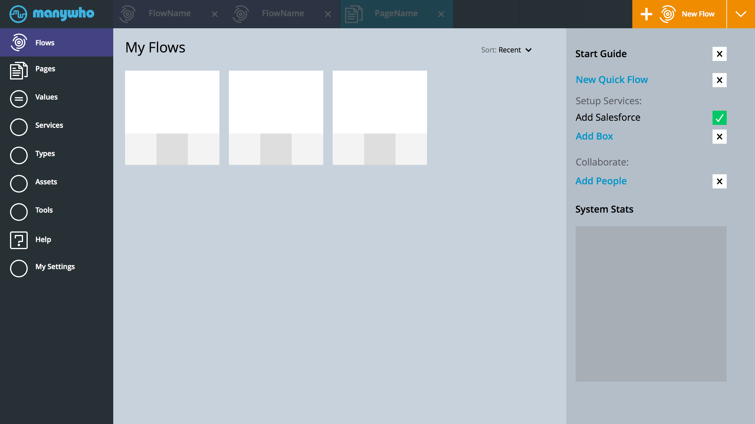
- BTW. was playing around with icons as well. I like your current loading spinner -- then I thought, hey that can actually work as a flow icon. Anyway, just an idea - not sure what the leaf does for you.
- Also, Pages icons. Something a little more descriptive.
- Creating something is now a persistent place on the interface. Top right. Since we are in flows, that is the default thing to create. The user can tap the arrow down at the end of the create block, and select to create something else. Example: They suddenly realize that they need to create a new value.
App/Flow Home > Into One Flow
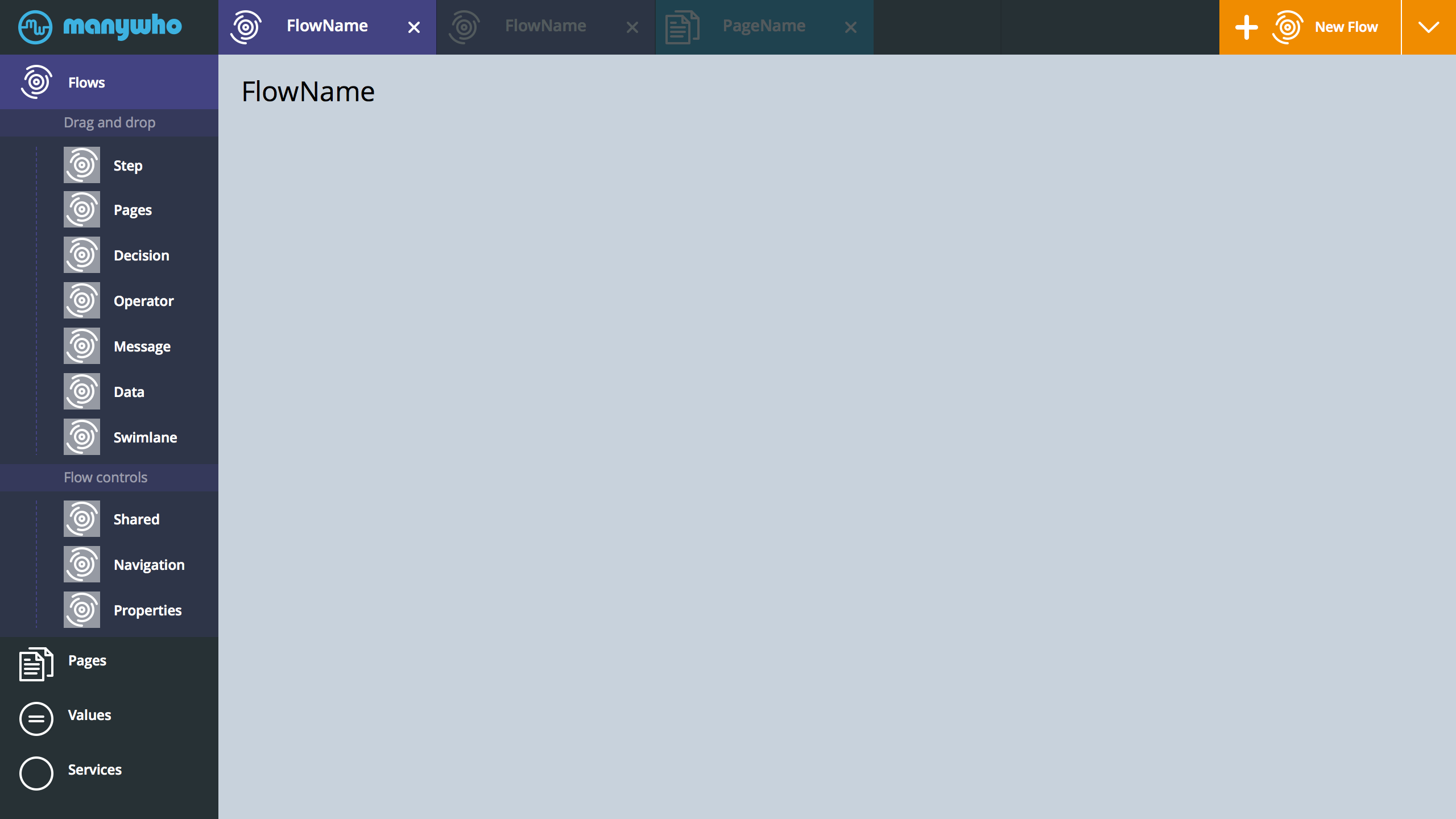
- User jumps into one flow. That could be a tab click (if flow already opened) or a click a flow tile
- Since we are in a single flow view. The flow component menu slides down. The left side is a scrollable region. All that happens to the other menu options is that they slide down further. User can still access values / help / services, without having to go home.
One Flow View > All Pages View
- Instead of clicking the flow home then pages, user clicked Pages from the top level hierarchy.
- This is the pages home. Similar to the flow home view. Using a different color for pages, trying to keep the app as colorful.
All Pages View > Single Page View
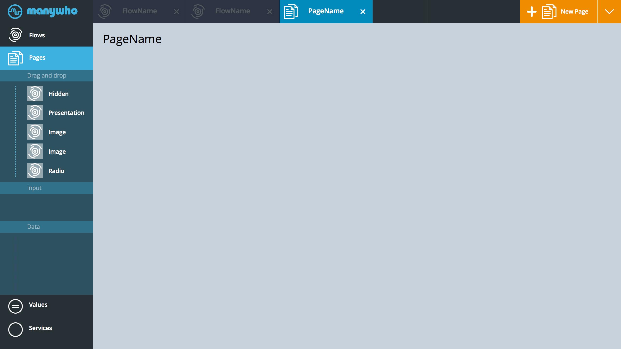
- Now I am editing one specific page.
Form To Form
- Issue: Need to remove the jarring experience when one form launches another form. Need to comfort the user and let them know, that we have not lost track of where they started. We just launched a new form to accomplish something complicated that couldn't happen on the form that you started with. Don't worry, your last form is still here. If people cancel, then they go back to where they came from and all is well.
- The screen above is one example. We take the header of the form that launched the latest form and dim-it + rotate it. slot it just to the left of the latest form. That way, it is clear to the user, cancel (takes them back) and save (accomplishes task then takes them back).
- Why this might work: 1.The active form is in the same location. You don't need to rethink where the primary action went. 2. You still know what the form that launched this is named. Leverage how things already more around manywho - more things left / right animation.
- This could work for launching the new value selector/create/sort/search panel.
- Other options: We could look into adding an inline path into the form. Although, that just seems boring.
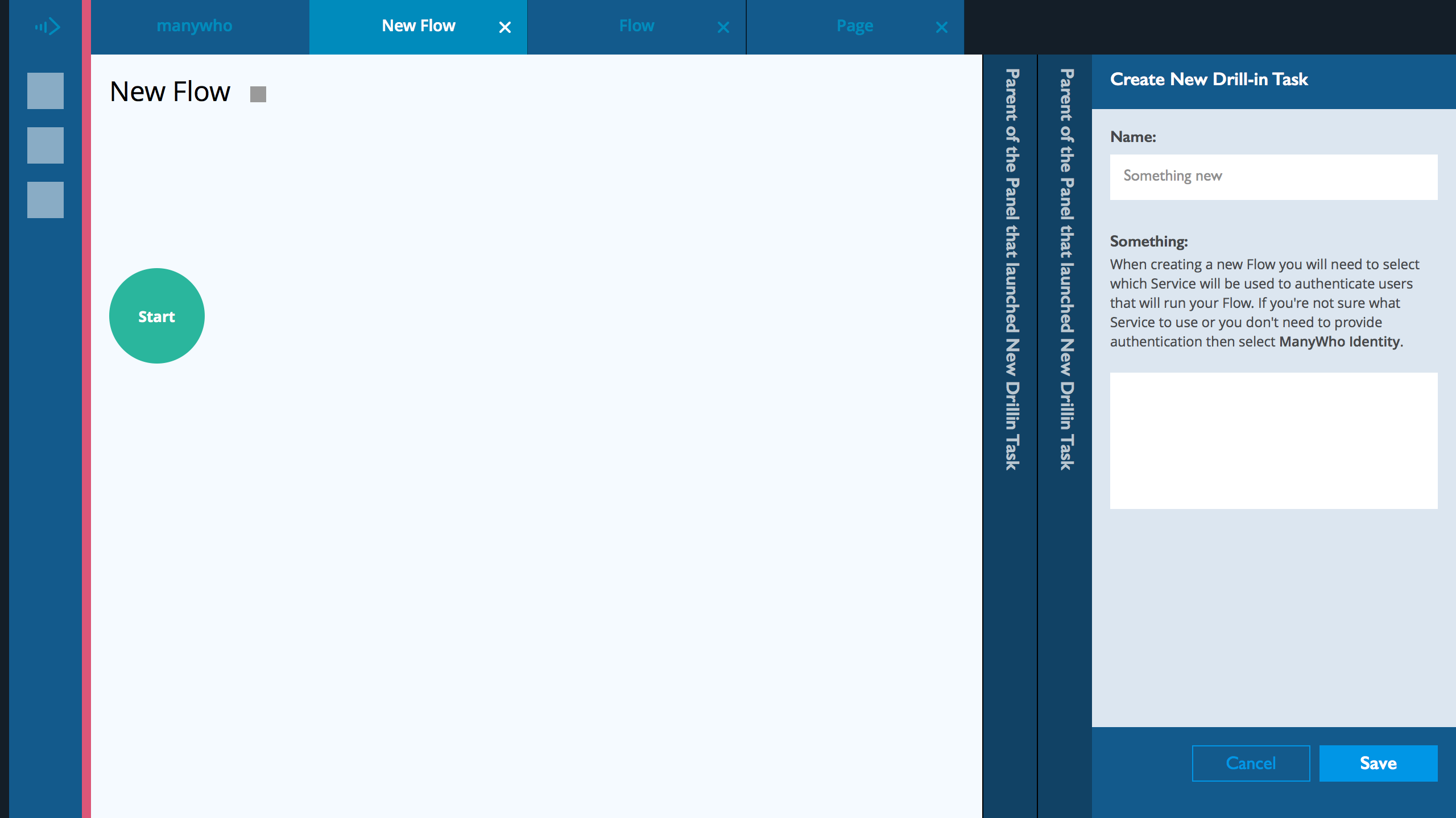
Create New Flow
- User Clicked Flows > New Flow
- Instead of the current New Flow page with one question and some info. We land the user into the Flow page builder. Get them oriented from the get go. Plus. This will introduce our builder interaction model. Diagram on the center page and form on the right.
- We dim the page to make it clear to the user what they need to do. The focus is the form on the right.
- The form on the right has a clear header and a clear footer. The header and footer are fixed locked in location. User can scroll up and down a long form and not loose sight of the context (header) or the required action (footer).
- The primary button on the page is the Save. Cancel is a secondary and that sends the user back to the Landing Page (or whatever they clicked to get here)
- PLUS. If we keep the primary actions in the footer in the same spot on the form, users will be trained to jump to the lower right to execute things. One thing less to think about.
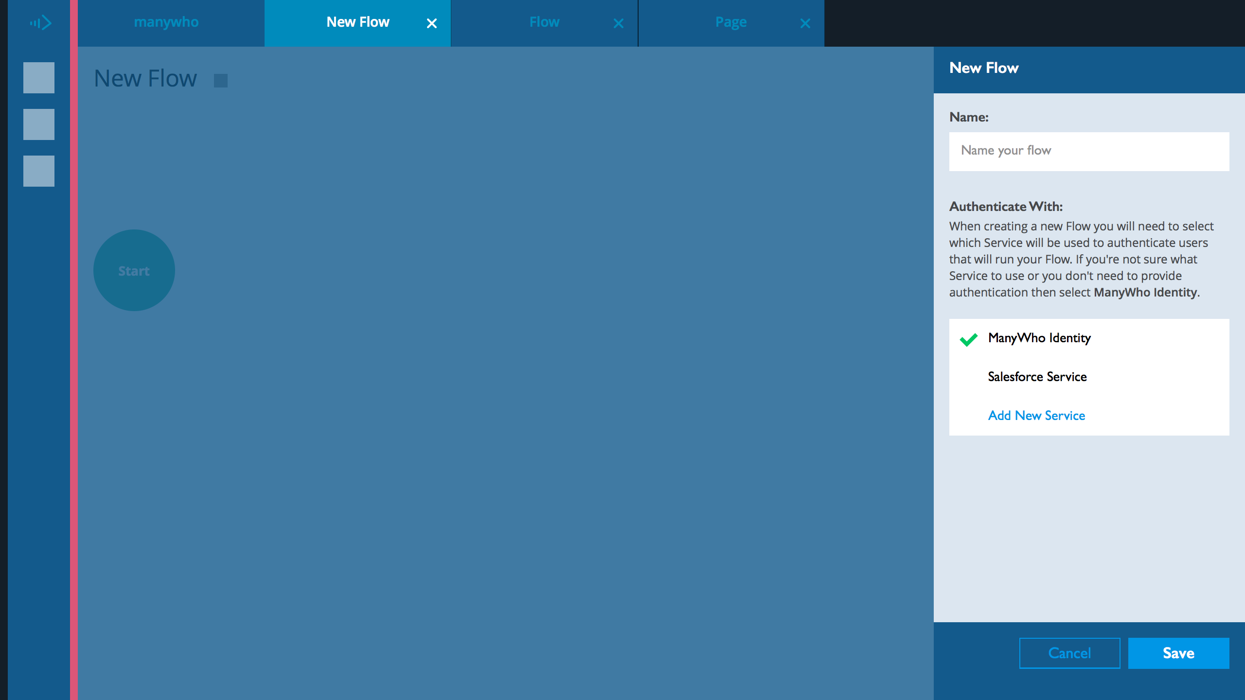
- Since this is a light-weight form, we expose the Identity options. Nothing is hidden. No need to tap a pull-down. We auto select the default option.
- In this example. The user can add another identity service - this is here to show how we fork the experience. Making it clear to the user, they can add another option into this selection list.
- Instead of the current two buttons (Back to Flows) and (Apply). Use (Cancel) and (Save). That way, the user doesn't have to overthink this.
- In reality, all they have to do is add a name and click save. Good to have them add a name, makes it a little more concrete of an action.
- As soon as they click SAVE. Update the title of the in the tab from new flow to the new name.
- BTW. Colors.. Sizes.. Fonts.. How things look will change frequently. One of the things that will flux (not to be confused with the flux capacitor) as I go through this project. Things will get normalized as soon as I get all the components identified.
Idea. Landing Tiles
- Tiles. Since this is hero of the application, the end game. We don’t want the landing to a list, or lackluster in accomplishment. You created something substantial. Plus a tile is good representation for an app.
- Component of each tile can include:
- Switch to Activate Flow (perhaps, you are still working on it or you want to take it down). Might not be needed.
- Name of the Flow. PLUS description.
- Stats around the flow, could be views, number of runs... something that tells the user that this is a living thing.
- Actions bar, below the tile - Tap to edit flow.
- Run flow, instead of edit then run - maybe you just want to run it. Remove a hurdle to get satisfaction that you made this.
- Delete flow.
- Other things this idea solves, noted earlier:
- Delete. Hmm. Not sure. Went back to the dashboard. I see a delete button. I click it. Seems like it might delete everything. OK. Maybe a selected state - ahh. Yes. a selected state. Very subtle. We need that to be a little more explicit. Perhaps, the functions are exposed at the get go - Edit Flow. Delete Flow. Edit Properties. Run Flow. Do you need to get into a flow to run it? Can you run it from the flow view?